We are back with a few items we hope you will enjoy.
We start with an addition to Kate’s Calendar: Saturday the Duchess joins Princes Harry and William for the England vs. Wales rugby match. The event is at Twickenham Stadium, the same venue where the Rugby World Cup Opening Ceremony was held last Friday. Below, times for Saturday’s match:
- London: 20.00, or 8pm
- EDT: 3pm
- CDT: 2pm
- MDT: 1pm
- PDT: Noon
++++++++++++++++++++++++++++++++++++++++++++++++++++++++++++++++++++++
Some readers are no doubt aware New York Fashion Week wrapped up on the 17th, and London Fashion Week concluded today. Milan Fashion Week kicked off yesterday; Max Mara showed this morning, and there are a few more Kate designers sprinkled throughout the Milan schedule. The party then moves to Paris for that Fashion Week; this is where Alexander McQueen shows (on the 4th), as well as Roland Mouret and Stella McCartney.
All of that brings us to our next topic, a look at one of the more interesting facets of New York’s 2 major Fashion Weeks each year: the Pantone Color Institute’s semi-annual Fashion Color Report.
The Report forecasts popular colors for the upcoming ready-to-wear season; in this case, next spring’s RTW collections. More on 2016’s top ten colors from Women’s Wear Daily:
Pantone’s Top 10 colors for spring are meant to ease the daily grind. There’s a psychological reason for that, according to Pantone Color Institute executive director Leatrice Eiseman. “The fact that technology has gotten so overwhelming and so 24/7 has really created a great part of the need for these comforting, softer colors.
‘Rose Quartz’ is the top color for spring. More on that hue from the Pantone Report:
…a persuasive yet gentle tone that conveys compassion and a sense of composure. Like a serene sunset, flushed cheek or budding flower, Rose Quartz reminds us to reflect on our surroundings during the busy but lighthearted spring and summer months.
Women’s Wear Daily story has this to say about the color:
“This really is a beautiful pink that will radiate well on the skin for women as well as men,” Eiseman said. “Women can always be helped along by cosmetics, but guys have to rely on the colors they’re wearing to sometimes make them look a little healthier.”
One of the top five colors caught my eye immediately: ‘snorkel blue.’ Below, more about that shade, including designers who have it in their spring 2016 collections.
Some will recall the color name immediately, but many will not, we’ve not seen it for some time. ‘Snorkel Blue’ is the shade used by LK Bennett in Kate’s Lasa Poppy and Detroit dresses.


All Photos by i-Images/Polaris
Pantone’s executive director offers this about Snorkel Blue:
Eiseman said this shade is “meant to be a bit more fun, less serious than navy, and serve as one of the anchor colors for the spring palette.”
It is a terrific color on Kate. You can see the Report by clicking here. Pantone is also running an online survey, you can vote for your favorite of the ten colors. Click on the image below and then look for the word “survey”.
As of this writing Snorkel Blue is leading the survey.
++++++++++++++++++++++++++++++++++++++++++++++++++++++
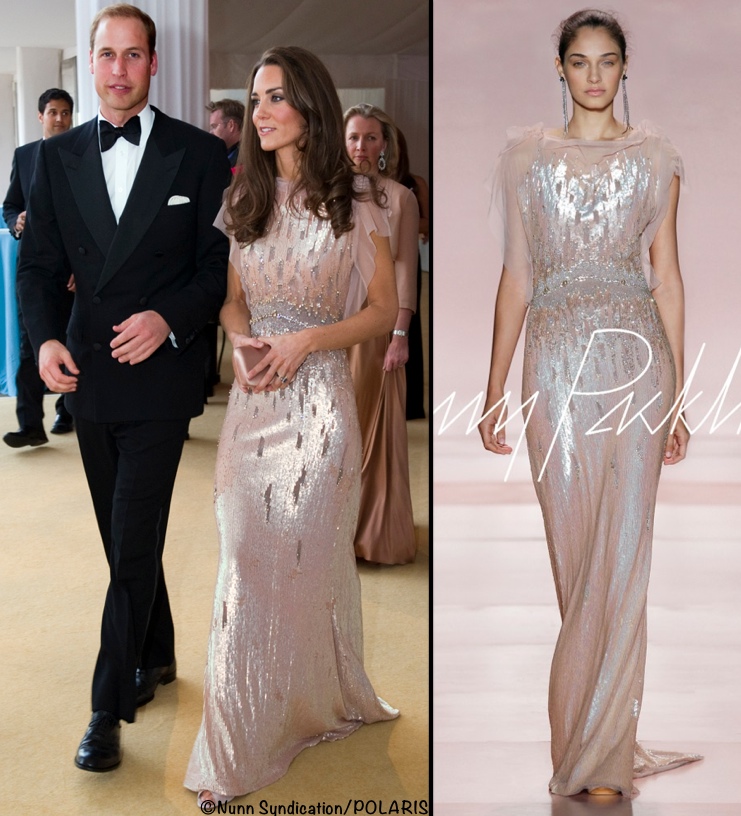
Our related topic today is Jenny Packham’s collection for next spring. Below, separates and a flirty, flouncy little dress from the designer’s runway show at New York Fashion Week.
From USA Today‘s story about the collection:
Packham, a favorite of the Duchess of Cambridge, and a designer whose creations have been worn by Kate Winslet and Angelina Jolie, says that she was inspired by such androgynous icons as David Bowie and Patti Smith, as well as the words of Susan Sontag.
Flowers were in abundance, thanks to a floral motif that ran throughout the collection. A floral suit, and a sweet, white crepe cocktail dress that sparkled with buds made of crystal, evoked the mood of a very chic English garden party, spring like and colorful.
British Vogue’s review wasn’t as positive about the floral pieces:
While the new emphasis on day-to-night dressing was promising, the androgynous concept didn’t quite translate for many of the looks. The suits were a bit too boxy, and Packham’s clientele relies on her for glitzy embellishments, not wildflower prints.
Someone from that red carpet clientele: American Horror Story star Emma Roberts wearing a Jenny Packham gown at Sunday night’s Emmy Awards.


Redstar/Polaris
The Women’s Wear Daily review echoes British Vogue’s sentiments about red carpet styles.
British designer Jenny Packham sent a few fresh and beautiful looks down the runway, but there weren’t as many as one would hope for from a designer who has dressed Catherine, Duchess of Cambridge, on multiple occasions.
Much of her evening collection’s more standard fare felt dated — not to be confused with vintage or the latest trendy decade — and some of the embellished numbers weren’t nearly as rich and luxurious as the red-carpet category demands.
Kate in a Jenny Packham dress at the June 2011 ARK dinner.

Nunn Syndication, Polaris Images/Jenny Packham
Kate on the red carpet in another Jenny Packham style, seen at the Greatest Team Rising Pre-Olympic Gala in May of 2012.


Splash News
Back to the USA Today piece:
Packham, who was trained as a textile designer showed off that skill with her intricate embroidery, a highlight of a tulle floral gown and a pair of black georgette, gold floral trousers.
Packham emphasized that her clothes are not just for royalty, or those who make their living appearing on the silver screen.
The chartreuse provided a welcome pop of color, while the second style from the left looks like an ideal cocktail dress.
It was fascinating to see how many of us who follow and/or write about fashion chose the same frock as being ideal for the Duchess; we’re talking about the dress in the center below. It went on our “I Could See Kate Wearing _____“ Pinterest board almost as soon as I saw images from the show.
From Us Weekly:
The gown boasts many details that the Duchess… tends to gravitate towards, including a sleeveless bodice, V-neckline, and billowing chiffon.
The Duchess would likely style the piece a little differently—with crown jewels, perhaps, plus her trademark bouncy blowout or an intricate updo, courtesy of her go-to hairstylist Amanda Cook Tucker.
My friend Kelly Lynch of The Duchess Diary had the same reaction, while the Fug Girls shared their thoughts on Twitter about the possibility of seeing Kate in the gown.


The Fug Girls Twitter
Three very different gowns. The embellishment on the blue and white style looks like it would be exquisite in person. I’m curious how the piece would look when lined, if that would detract in any way from the featherweight look of the garment.
We wrap up with a final note from WWD’s coverage:
Packham’s sleek, midcalf, cap-sleeved sheath in a French-blue floral lace with gunmetal accents was her chicest look — and an indication that talent is there.
We’ll see you Saturday for the rugby match.

ElizaMo
Friday 25th of September 2015
Thanks for a fashion feast, much appreciated. The Packham creations look a little more quirky than usual and the prints are interesting. Busy floral prints don’t work for me but these are nowhere as confusing as some.
I’m afraid I don’t see Kate going for another hi-lo dress, particularly not one with such a large ruffle. I think she might tend more toward something more minimal and sleek like the full length silver-glitter. She has certainly favoured those bell sleeves from Beulah though for me they have too many echoes of Biba, something I had my fill of the first time around. Totally agree with you choice of cocktail dress, though, that looks right up Kate’s street.
I don’t think colours necessarily come into fashion by themselves, I think we are told season by season what cloth manufacturers have already chosen, decisions about dyes having been made months ago. When a teenager I once took it into my head to try to buy colours not in fashion and found they didn’t exist – I seem to recall the Meryl Streep character in The Devil Wears Prada being particularly succinct on this topic.
One thing that does puzzle me though is – does anyone know how snorkel blue got its name? I think I might have called this shade royal blue up to now. Could it come from the colour of swimwear somewhere along the line?!
Lili
Friday 25th of September 2015
I suppose I think of royal blue as a somewhat deeper shade, closer to cobalt, but color labels tend to be rather malleable, I find. I attended Yale, which has supposedly copyrighted or patented "Yale Blue," and I've tended to describe that shade to people as a variant on "royal blue," but the example given on the site below doesn't look like the Yale Blue I know.
If you scroll down to the foot of that site, you'll see a lot of blue shades, some of them not all that easy to distinguish from one another.
The swimwear explanation for "snorkel blue" is as good as any. An online search doesn't turn up one, but it does turn up a LOT of athletic gear, including swimwear, described as being "snorkel blue".
https://en.wikipedia.org/wiki/Yale_Blue
Judith
Thursday 24th of September 2015
Oh, thank you! This was a lovely collection. There's a lot of potential Kate looks, though most would need modification to be appropriate to her status as a royal. Even the tie-dyed items, while right out of consideration as is, had beautiful lines. That floor length floral was yummy, though very seasonal (maybe an overseas trip next year), but I agree on that jade green with the opening.
Pantone: a group of people who make a committee decision about what we're going to love next year. You won't be catching me in any snorkel blue! It makes me look like I died and went bad.
Rachel
Thursday 24th of September 2015
I love Jenny Packham, she always makes the most amazing gowns. My lifestyle doesn't include any sort of occasion to wear something of her's, but it's my dream to wear a Packham gown when my husband and I renew our vows down the road. Off to add a few more to my "vow renewal" Pinterest board!
The Way We Were
Thursday 24th of September 2015
I have always liked all shades of blues, especially the more saturated ones, cobalt, royal, turquoise... but I also find it one of the hardest colors to work with if it's not a one-piece item... But that's just me who is not very creative. :)
Lili
Thursday 24th of September 2015
I'm always amused by the Pantone color picks, but the fashion world seems to take them seriously, and they do show up in collections -- sometimes rather over-abundantly. That rose quartz shade would be fine on me, a fair-skinned blue-eyed blonde, but I don't think it would be our Duchess's best color. It does seem to have a little more body, however, than the pale pink shade that, I commented the other day, tends to look rather anemic on her.
I didn't see much in Packham's new designs to excite me, but she goes for a lot of embellishment, and I tend not to react well to that. British Vogue may have felt the collection wasn't embellished enough, but it seemed plenty glitzy to me. It will be interesting to see what will appeal to the Duchess and how it might be tweaked for her. I did like the French-blue sheath, despite my oft-stated dislike of the all-lace look.
So far, the Spring/Summer collections in general have left me a little cold. I'm seeing a lot of somewhat distressed or "piece-y" items that look like they've been plucked from the rag bin or are the result of an unfortunate machinery malfunction at the factory. (See Christopher Kane, for example.) Otherwise, the runways are billowing with puffy sleeves (er, "sleeves with volume"), fussy florals and other prints, and floaty faux-boho frills and furbelows. It's all a bit much for my minimalist sensibilities.
I'll have to take a look at Max Mara, the designs for which tend to be fairly reliably restrained.