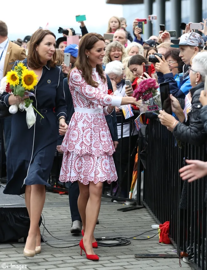
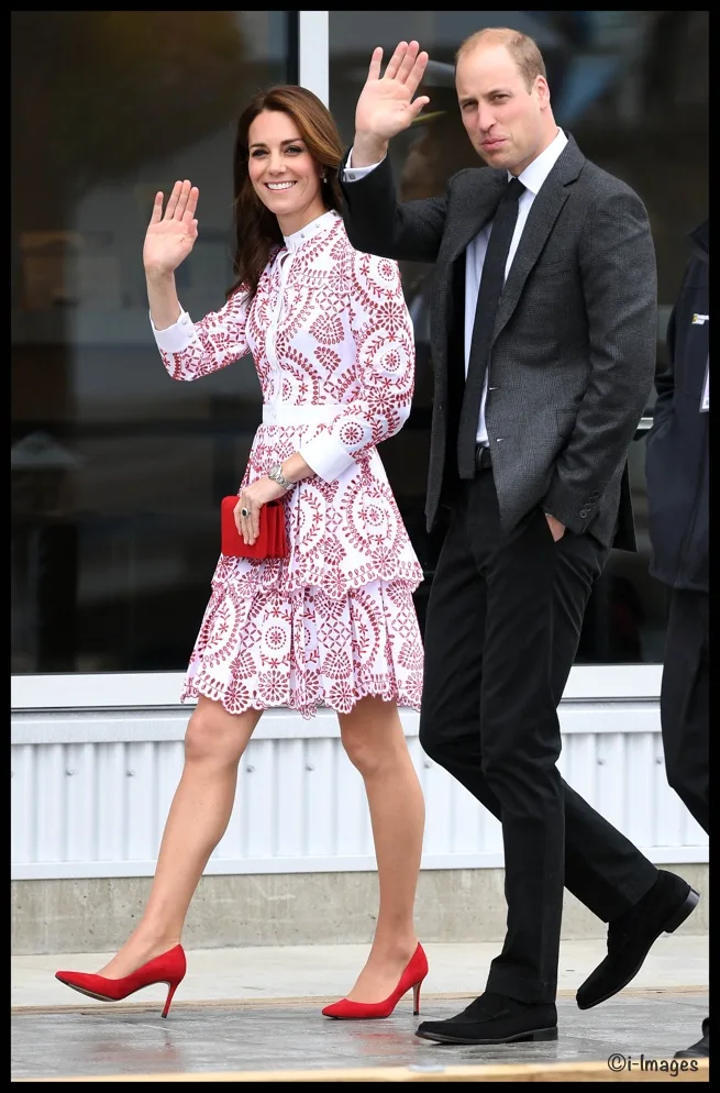
Kate returned to a favored designer for day two of the Canada tour, choosing Alexander McQueen for a series of engagements in Vancouver.
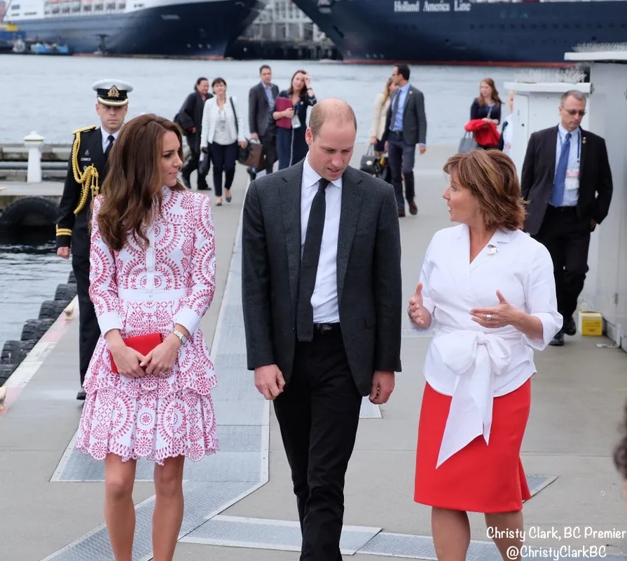
The couple being welcomed at Vancouver Harbor by British Columbia Premier Christy Clark.
From Rebecca English’s Daily Mail story:
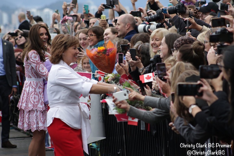
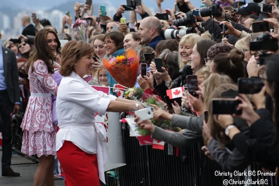
This morning the couple boarded a seaplane from Victoria to Vancouver, where they were met by thousands of well-wishers who had gathered on a cool, damp morning to catch their first glimpse of the royals.
From a Hello! story about the engagements:
Huge crowds had turned out at the harbour side to catch a glimpse of the British royals despite the drizzly weather, and both William and Kate were clearly touched by the warm welcome they received as they emerged from the aircraft.
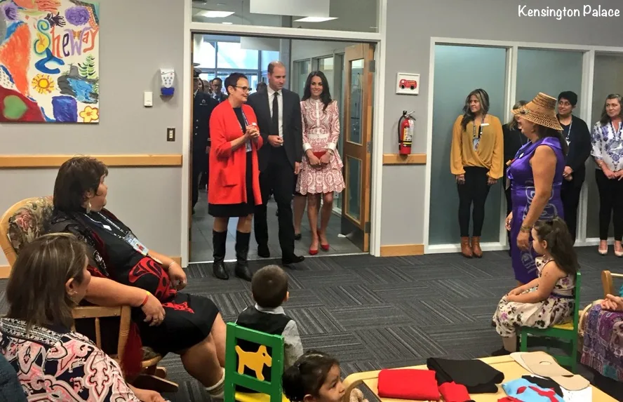
Their first engagement was at Sheway, a pregnancy outreach project in downtown Vancouver.
The Duke and Duchess have arrived @ShewayBC Excitement from the crowd! pic.twitter.com/XlFKFlKT0K
— Emily Lazatin (@EmilyLazatin980) September 25, 2016
From a story in The Province:
The Duke and Duchess of Cambridge’s promise to meet with all kinds of Canadians took them to Vancouver’s gritty Downtown Eastside Sunday, where they met with mothers recovering from addiction who said the visit helped show them they are respected, despite their struggles.
And from Hello!
The Duchess of Cambridge shared a tender moment with a young girl as she and Prince William spent time at a pregnancy outreach program on Sunday. With William by her side Kate, 34, also spent time speaking with new mothers about their experiences of overcoming addiction, expressing interest as each of the ladies shared their stories.
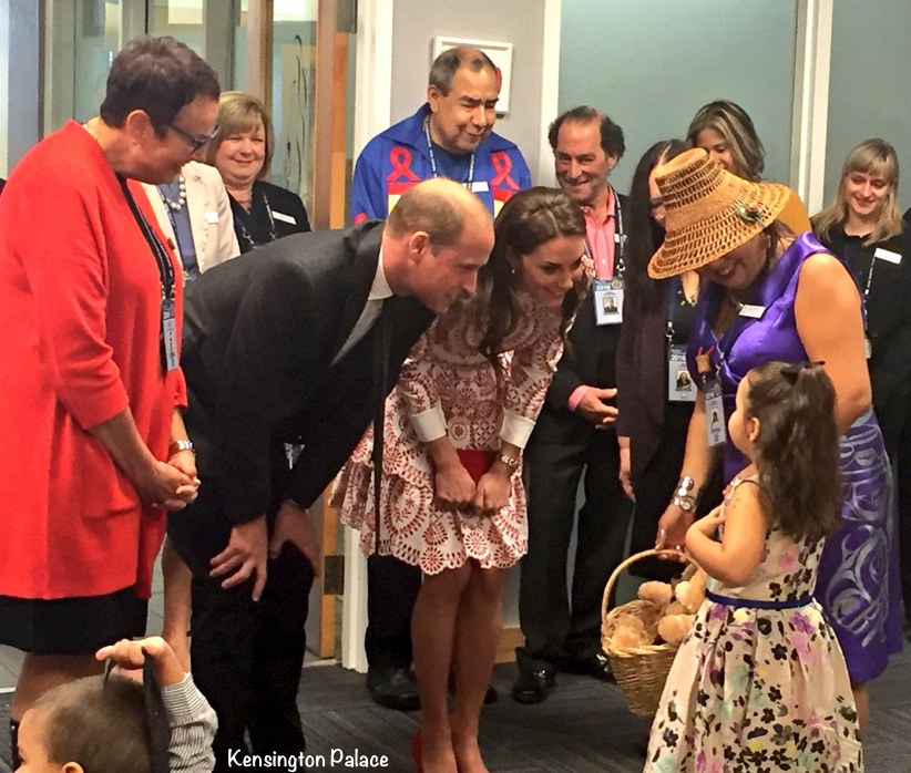
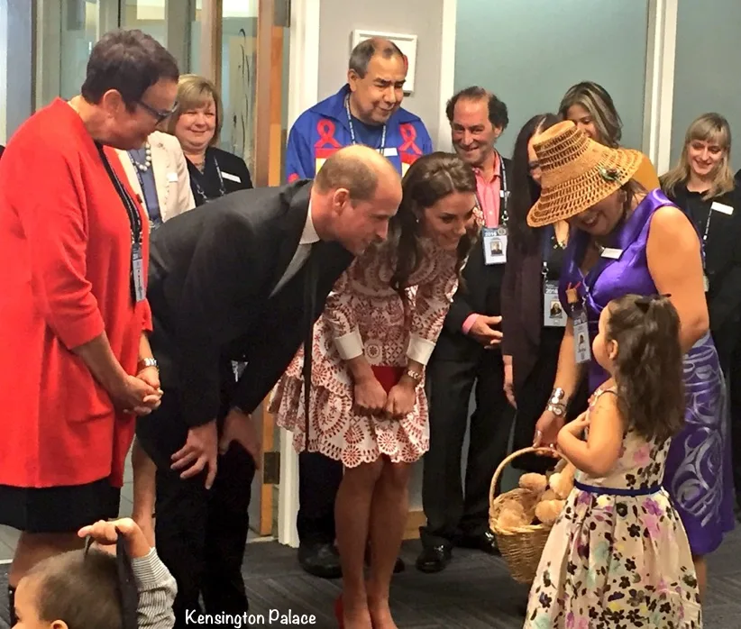
The Duke and Duchess were given gifts for Charlotte and George. From an AM730 story:
….staff member introduced the couple to a five-year-old girl, who gave them both teddy bears. “George would love this,” William said, referring to his son, as he accepted a teddy bear in a black vest.
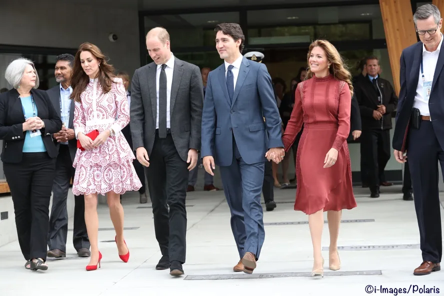
Kate and William then traveled to the Immigrant Services Society of British Columbia (ISSBC). Denise Ryan of The Vancouver Sun shared this photo of the Trudeaus arriving; she noted the crowd was singing O Canada.
The children you see here are from families benefiting from the Society’s services.
Kate, William, Justin Trudeau and Sophie Gregoire Trudeau leaving the Immigration Society.
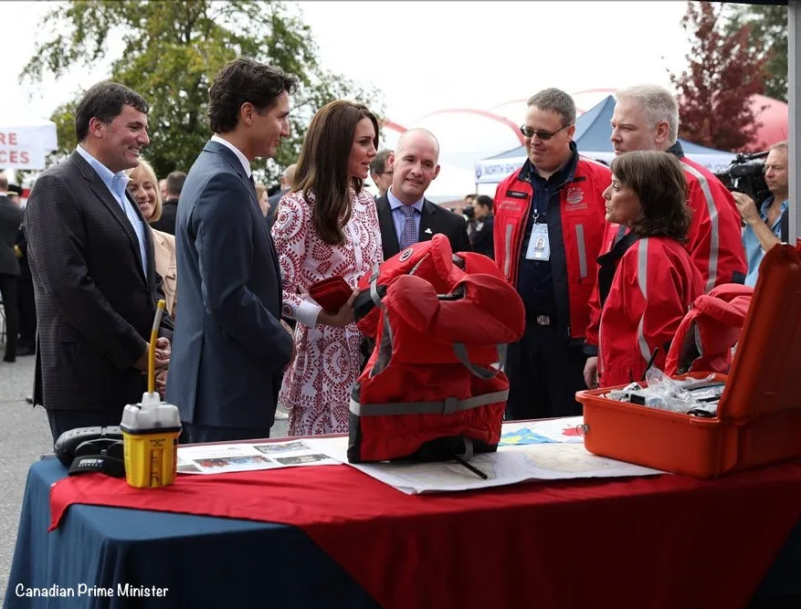
The Cambridges and Trudeaus spent part of the afternoon with emergency services personnel. More from the CBC:
Just after 3 p.m. they arrived at the newly reopened Kitsilano Coast Guard Station to discuss the mental health challenges of first responders, and meet Indigenous leaders.
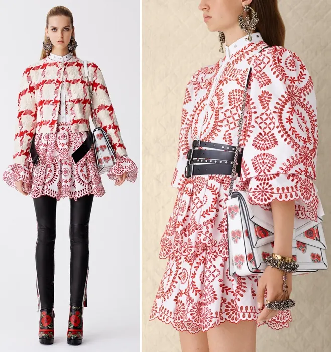
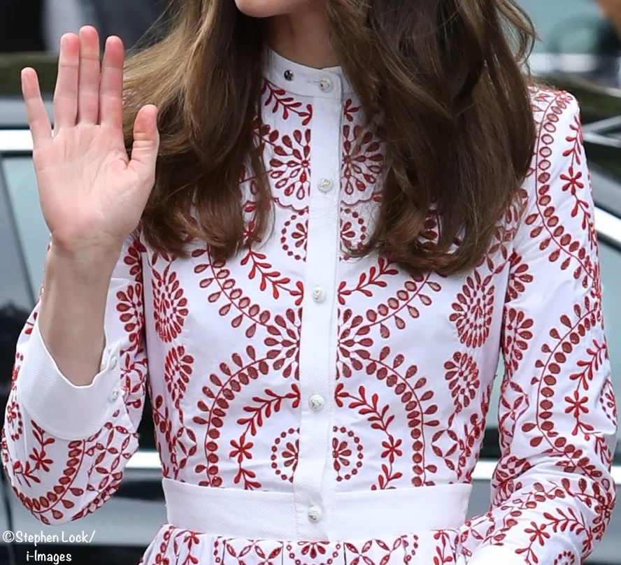
Now to what Kate wore. The Duchess was in bespoke Alexander McQueen, a version of a dress from the Resort 2017 collection.
Not only was she returning to a favored designer, but she was also going back to one of her favorite textiles, broderie anglaise. 
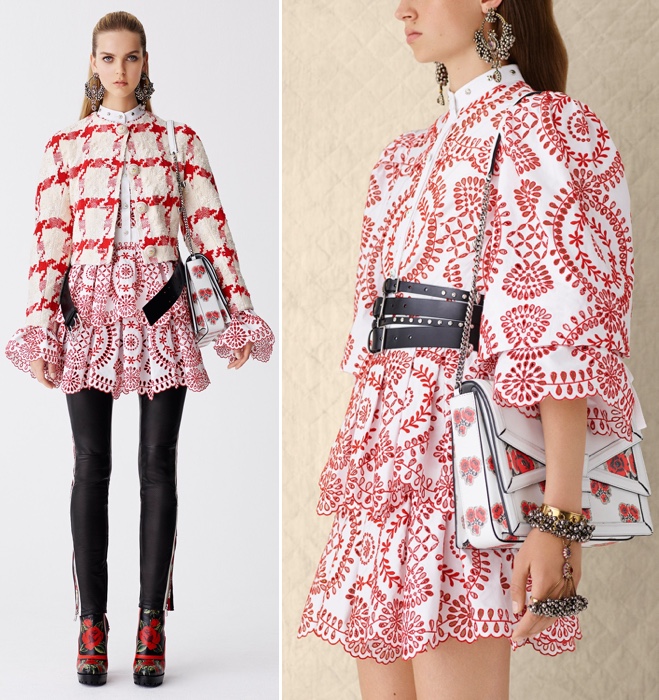
A closer look at the fabric.
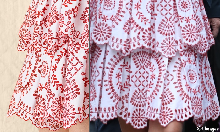
Broderie anglaise is a material we’ve seen the Duchess wear with some frequency. So much so, we dedicated a good portion of this post to Kate’s fondness for the textile. Below you can see the origins of Kate’s dress.
Both the bespoke version and off-the-rack frocks feature a fitted bodice with a contrasting band collar. But then the designs diverge: the billowing open sleeves with their wide silhouettes have been removed, replaced with a longer, more standard (fitted) sleeve shape. Cuffs have been added to the sleeves on the Duchess’s dress, and a white waistband.
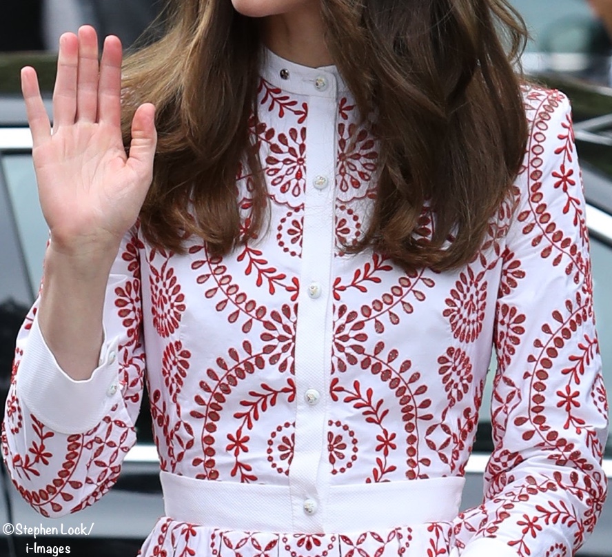
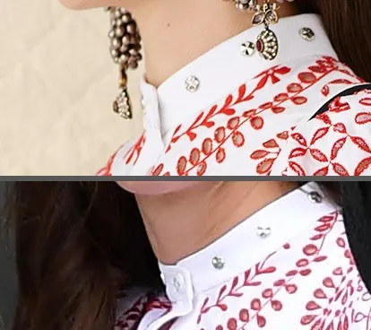
It’s difficult to see above, but the buttons are very pretty, they appear to be handpainted. Below, a closer look at the collar shows this element is essentially the same on both garments.
From The Telegraph’s fashion story:
The Duchess of Cambridge has become remarkably adept at bringing a mixture of labels to her royal wardrobe; one week it’s a £22 pair of trousers from Gap, the next it’s a bespoke designer piece.
It’s a strategy which is masterful in its execution, one moment giving an impression of complete accessibility, the next adding a soupçon of aspiration (think the L.K Bennett dresses she has favoured this summer) and then introducing a look into the mix which serves as a reminder of The Duchess’s dazzlingly glamorous royal credentials.
We have another look at the frock in this photo of Kate with Sophie Grégoire Trudeau.
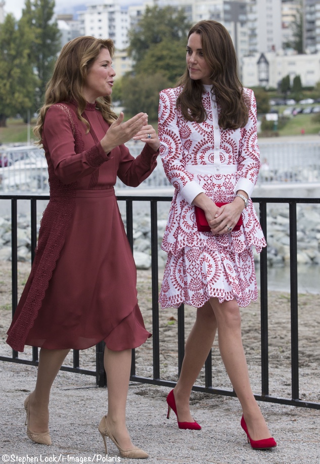
Surprisingly, I think this was a good choice for the Duchess. On first glance the immediate reaction was “My, don’t we have a lot happening here, and all at once.” I thought we were headed for sensory overload between the striking red and white fabric, the ruffles and tiers. But I think it ultimately performed well: the colors were a respectful nod to Canada and the design suited Kate. Having said that, I think it worked well today – for this situation and set of circumstances. It’s not that it was contrived or gimmicky, but I do struggle a bit trying to see it at other events, like a garden party, where I think the color scheme would be loud. This one has potential for polarization, at least from what I gleaned on the Facebook page and Twitter.
The Duchess was carrying a new handbag, the Bow-Embellished Suede Shoulder Bag from Miu Miu.
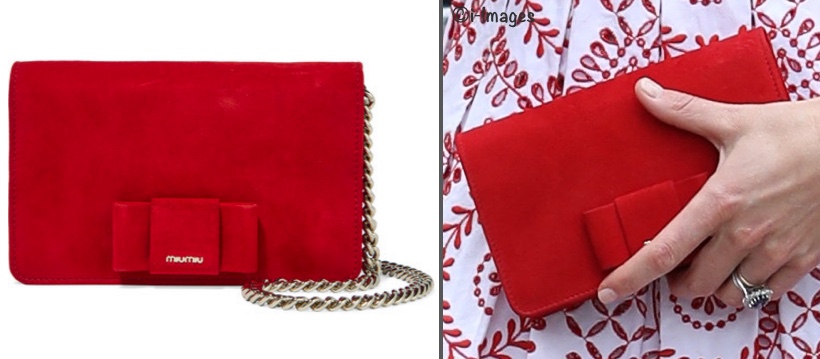
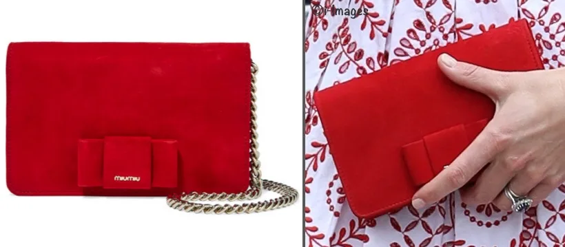
The brand is new to Kate’s wardrobe as best as we know. It is the more youthful, hipper offshoot of Prada. Its name comes from Miuccia Prada’s nickname, Miu Miu. Kate’s clutch measures 7″ x 5″ and about 1.5″ deep. It has three interior pockets and can be carried over the shoulder or as a clutch. The back of the bag is unadorned.
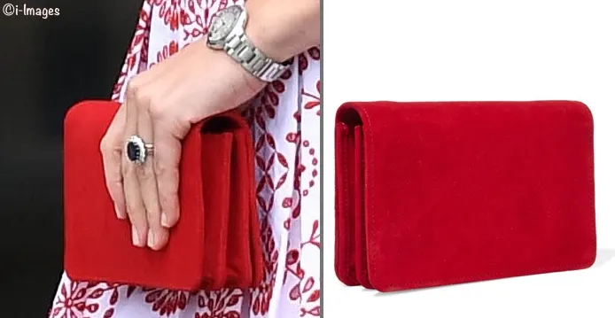
It is still available at the Net-a-Porter US site ($895), as well as on the UK site £640). Our thanks to Gemma of Food, Fash & Fit for identifying the bag, with an assist from Christin.
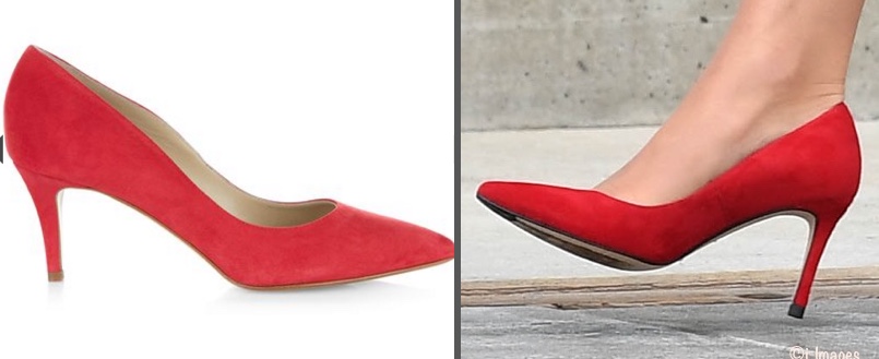
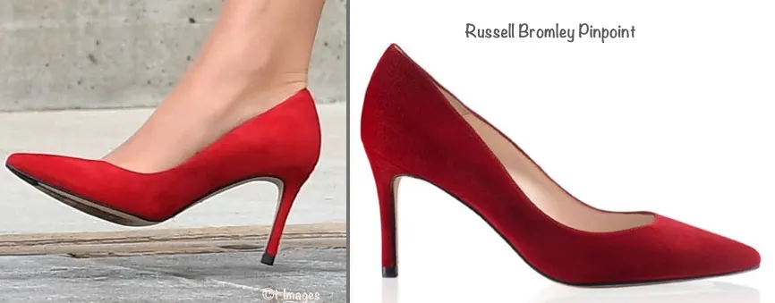
Now to Kate’s red suede heels.
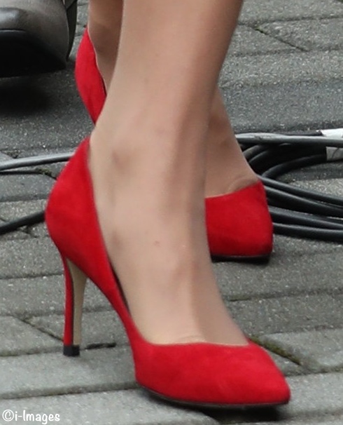
NOTE: Scroll through to the last pair of shoes for an update on the ID.
The shoes remain a topic of discussion. Because people sometimes ask how things are identified, I thought I would share a little bit of today’s exercise with the new heels. It’s not terribly exciting, it merely offers a tiny window into what might be discussed when considering a vast array of (in this case) red suede heels.
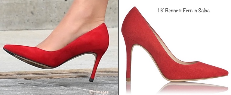
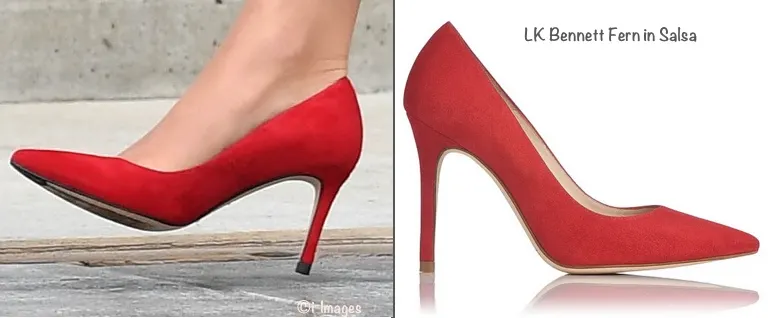
After first seeing Kate initially the thought was that she could be in a pair of the Gianvito Rossi pumps she wears so frequently. That wasn’t the case and the search ensued. One leading candidate was the Fern from LK Bennett in the salsa color. If you look at the heel tip you can see Kate’s is black and the LKB is not. But even if the Duchess might have had a new tip put on, there’s another issue: Kate’s sole is dark and the Fern soles are light in color.
Another suggestion was the Romy by Jimmy Choo. The issue, in this case, was the light sole vs. dark sole.
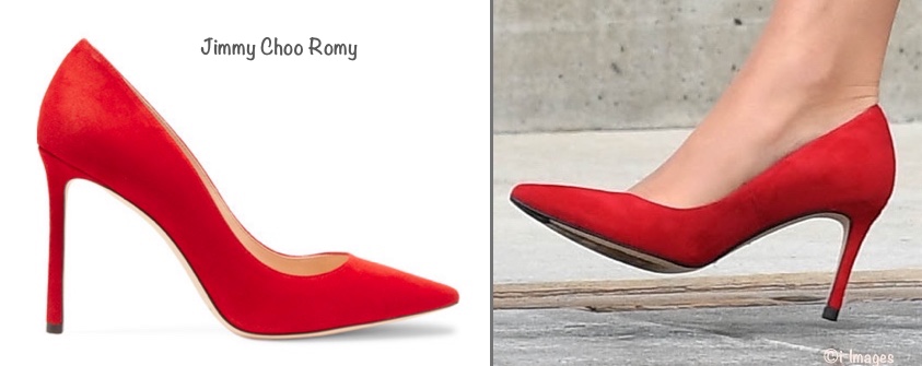
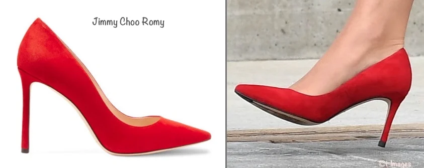
Next on the hit parade, the Hobbs Eliza (I believe this was the shoe being discussed.) Not at all the same.
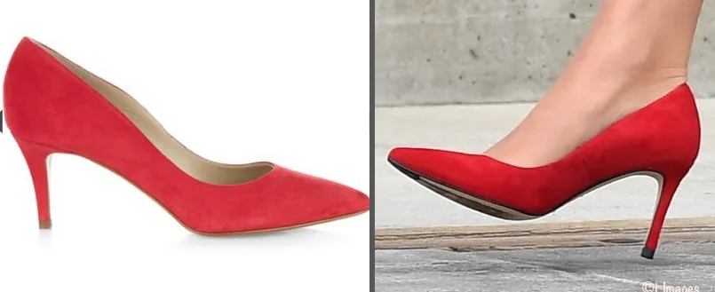
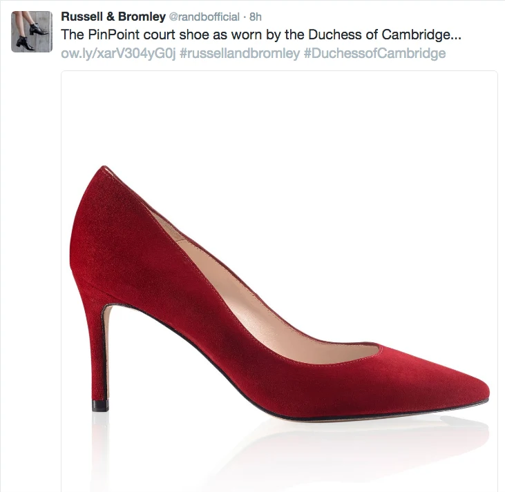
We all (‘all’ being the constantly changing group discussing an item on Twitter, Facebook, via email, direct messages and the like) turned our attention to the Russell and Bromley ‘PinPoint‘ after it was suggested as a possibility. The soles look similar; shape and color also look correct. To me, the heel height appears like it could be off by an mm or two. Hopefully, we’ll hear back from Russell and Bromley and I will be wrong, because that would mean the style is identified and that’s a beautiful thing, especially during a tour.
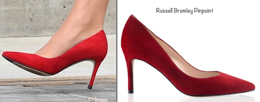
UPDATE: Russell and Bromley say Kate is wearing their PinPoint style. Yours truly is happily wrong, and we have the shoe identified. The PinPoint is suede with a leather lining and sole, the heel is 8cm, a touch over 3″. The style sells at £165, roughly $225.
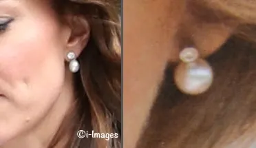
Now to Kate’s earrings. A number of comments were shared online suggesting the silvertone earrings were probably intended to better match the studs on the collar, a good premise.
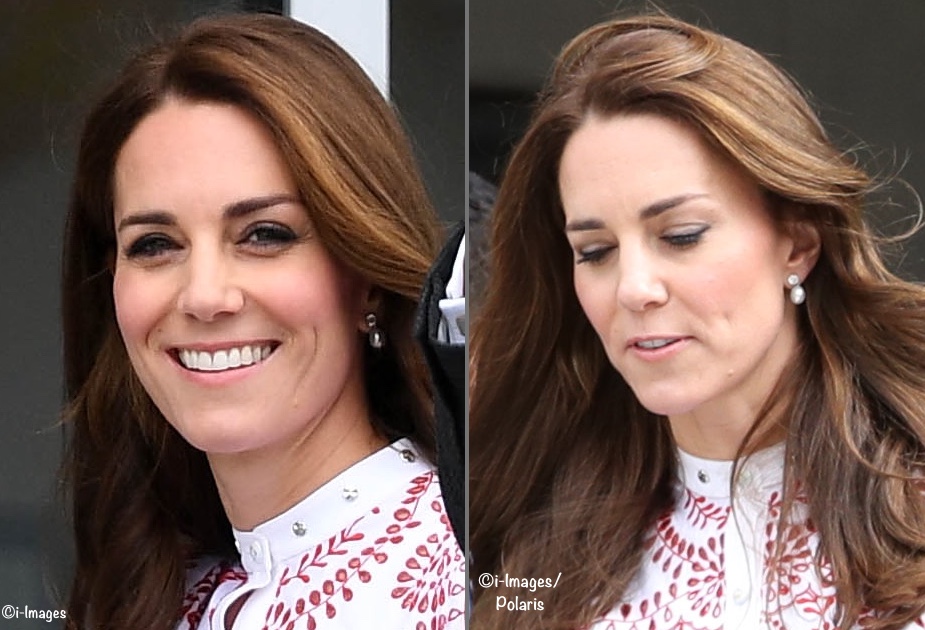
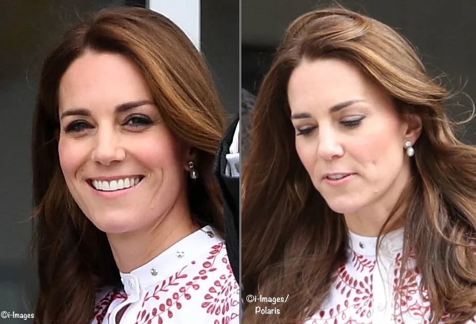
After much hunting, we heard from Tammie Selkirk, a delightful WKW Facebook friend. She suggested the Duchess was wearing the Detachable Pearl Drops from Heavenly Necklaces. Putting the product shot side-by-side with Kate’s earrings it looks very close to a match. We know Kate has worn the brand, and she also likes detachable drop earrings. We’ve contacted Heavenly Necklaces and hope to hear back from them tomorrow. See update below.
UPDATED: Belinda at Heavenly Necklaces was wonderful and got back to me immediately. She believes they look like the Detachable Drops but can’t say for certain that Kate is wearing them. Anna of My Small Obsessions added another facet to the discussion today. She owns the Heavenly Necklaces pair and says Kate is not wearing that style. Anna believes Kate may have been wearing a pair of the Queen’s earrings, a pair loaned to Sophie, Countess of Wessex on one occasion. You can see Anna’s photo montage here, it shows showing HM and Sophie in the earrings, as well as Kate, and the similarities are striking. UPDATE 3, OCT 11: We have confirmation this is the pair that Anna of My Small Obsessions believed to be on loan from the Queen, previously worn by HM, as well as Sophie, Countess of Wessex. Reporters verified this when the Duchess was seen wearing them again in the Netherlands.
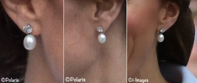
UPDATE 2, OCT 7: We had an intriguing comment by “Duchess fan from Downunder” suggesting a reference to a very similar pair of earrings worn by Diana, Princess of Wales when she visited St. John’s Newfoundland in 1983. Below left, Kate’s earring, and on the right, one of the earrings worn by Diana.
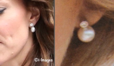
While the earrings are very similar, they do not appear to be the same pair. The biggest distinction between the two pieces is the stud portion; the pair worn by Diana has the top stone bezel-set, while Kate’s appears to be a standard setting. Additionally, Kate’s stone also looks larger than the stone in the pair worn by the late Princess. I think Anna of My Small Obsessions, “Duchess fan from Downunder,” and others are probably correct in suggesting Kate’s earrings were loaned to her by the Queen. If you would like to see a photo of Diana wearing her red/white ensemble with the earrings, click here. Our thanks to “Duchess fan from Downunder” for letting us know about the similarity between the earrings, what a great eye for detail and excellent memory!
Here’s your refresher schedule for Monday and link to our Canada tour pages here and detailed schedule here.
We’ll leave you with this quick video.
Watch Prince William and Kate arrive in Vancouver by float plane and greet crowds https://t.co/YY7yQmw0Qe pic.twitter.com/OlguVQh5xY — CBC British Columbia (@cbcnewsbc) September 25, 2016
LINKAGE:
- The Sheway website is here; the group’s Facebook page is here and Twitter feed here.
- Learn more the BC Immigrant Services Society at the organization’s home page here; its Facebook page is here and Twitter feed here
- The Express story from Richard Palmer is here; a photo-laden Daily Mail story is here; CTV’s photo gallery is here; the Global CA photo gallery is here
- The Hello! story is here; The Mirror’s fashion story is here; The Telegraph’s fashion story is here
- The Vancouver Sun’s rolling live royal blog is here; The Daily Mirror’s live blog is here
I’m in the minority, but I genuinely love this look! I love that it’s a risk, and it could have gone all wrong, but to me it all works wonderfully! I think the tiered skirt is great for her figure and she’s got the perfect figure to wear tops or dresses that are tight, and buttoned up to the top of her neck. To me, this is a very fashion forward, risky look and I just love it.
I love this look on her. So nice to see her in a print. I love the complex pattern.
From a high (the lovely blue dress) to a low (this one).
NOTE: Quick admin edit.
Thanks admin. The part you deleted was not meant to offend. And there are far worse remarks I’ve seen on this website. From my part it was only an observation. By the way you published the remark from “Annie” below. It says ” In reality, it looks just like something I would put on my four year old daughter.”. This remark is not far from what I wrote.
Nor was the edit intended to offend, I am doing the best I can under some exigent circumstances. Thank you for understanding. 🙂
I really, really disliked this look, after yesterday’s total perfection (the blue arrival outfit). Something is just off with this dress – too fussy. If only the top and sleeve were more simple or if the skirt wasn’t tiered. Didn’t like this or the loose hair. Shoes and bag and earrings were nice though.
I like this look – I want to LOVE this look, but on closer inspection it has too many issues. The collar is simply too tight – you can see it puckering. The skirt is just a bit too short. As someone who shares Kate’s long waist-ed silhouette, I’ve had to learn the hard way that a high waist-ed style looks just too juvenile. Even if this were at someone else’s natural waist-line, for Kate it just hits a bit too high and looks off. And really, if you are getting a bespoke dress, why in heaven’s name didn’t they adjust the waist for her.
In theory, I love everything about this look. In reality, it looks just like something I would put on my four year old daughter.
I am VERY happy to see red shoes. Love me some red shoes.
Very nice. Good fit! Hair needs to be tamed.
I actually quite like the dress. What I think causes the discord is her hair. This is more of a flirty updo dress (like a curly ponytail or even just pulling the sides back by braiding them and curling the rest of her hair) and not a “let all of your hair play around your face” dress. It’s a really flirty, girly dress with a slight edge. It needs that kind of girly with a slight edge do.
I do agree about the hair.
I gasped when I saw this dress! So happy to see her in something a little less conservative and demure. It seems to me she’s more adventurous in her sartorial choices when she’s traveling. I really like this look.
The major problem with this dress is indicated by all the comments – each individual part of the dress is being vigorously analyzed, and there are very few comments about an overall “look”. When the componets demand attention, and you add them all up and that’s all you get rather than a overall coherent impression, there is a problem. I agree that there seem to be two different approaches taken here, schoolmarm on top, dancehall skirt on the bottom.The hair is yet another confusing factor, another texture and pattern on top of so many existing textures and patterns. Just think if the top layer of the layered skirt were removed, and the top (modified or not) flowed elegantly into the flowing skirt, with the hair under better control (though not as tamed as yesterday_ – now there is a look that would be easy on the eye and probably beautiful in motion. The strong clear unpatterned reds of shoes and purse provide a welcome visual relief. That and the happy look of the Duchess! If she is delighted wearing this high-waisted richly patterned dress composed of so many disparate parts, then fine.
Love this look! And Looooooooooove the red shoes! The only thing I wish was different is the high collar. She often wears high collars and she looks strangled each time…
I like it! Where else can a princess wear a dramatic, out of the box, high fashion dress if not on a royal tour? The detail and workmanship are truly mind boggling.
Love it, maybe could do without the buttoned up collar with the studs, but overall this looks great!
Oh dear, after such a brilliant start, a stumble. My first thought was – here we go, back to the flower child 70s look – an impression reinforced by the long, rather lank hair.. If in this case “fashion forward” means the current trend to 70s then that’s what it is, but its not edgy or fashionable in my opinion. Then I saw It was another do-over of an Alexander McQueen design -lke the one that lead off the India trip with equally uninspired results, although this one at least fits better. I don’t understand why her “stylist” doesn’t just find a dress that she likes, rather than rehasing a McQueen design into something its not? The original McQueen design subverts the frills and fussy pattern by exaggerating the sleeves and pairing it with a tough leather belt. That is fashion forward. This is a mishmash of classic shirtwaist and tiered “gypsy” skirt. The pattern has nothing to do with Canada’s colours (which are closer to the colour of the pumps) or Haida design. As with the India dress, did someone think a vaguely ethnic pattern would be close enough? With a neck that tight (why, oh why?) Kate’s hair should have been up which also might have offset the little girl look of the skirt. While I cheer the bright red pumps and clutch, they are the wrong shade of red – orange red rather than the blue-red of the dress. Tomorrow is another day….
Your comment of mishmash of ‘classic shirtwaister and tiered skirt’ puts it very well. I find those cuffed sleeves more or less finish it off – badly! It can be amistake to attempt to tone down the outlandish elements which were the core of the piece in the first place. In this case I don’t think the alterations worked.
I like the idea that the earrings may be on loan from the Queen. Just a thought, but is it possible the queen would have gifted a pair of the earrings to both Sophie and Kate? The diamonds and pearls could easily have been repurposed from a broach or tiara that the Queen no longer wears. I have heard of women who gift diamonds from earrings or other jewelry to their sons to use as engagement rings for their wives. The design on this pair is so simple they could easily be recreated.
I didn’t initially like this look at all but it is slowly growing on me although it reminds me a little of a cake. I did notice that the top wasn’t quite tailored a way I would like as the buttons seemed to be pulling accross her waist. I would have also liked the waist pulled down slightly. And actually, as a note, I think she should try a drop waist sometime as she seems to have the illusive body type that can pull that off.
The one thing I think may have made a huge difference in the look is her hair. I know she has great hair and she should flaunt it but today I thought that amount of volume with all the other details of the dress just did not work. I would have liked to see something sleeker or more contained which I believe could have made a big difference in the look.
Sigh. Yet another reason why I miss Princess Diana’s style so much. Yes, fashion has changed, but she had a way to coordinate outfits in a way that would make them stand out so spectacularly. Little touches like a black tipped red shoe to coordinate with a red and black Houndstooth suit. I’m sorry to say that Kate’s style just doesn’t do it. For starters,the red shoes and purse are a different hue than her dress. Yesterday’s brown shoes with the blue dress? Boring. I always get excited with the hope that another tour brings another set of outfits that will “wow” me. But then I go back to my Princess Diana style books and flip through the pages with nostalgia.
First off, I need to say that I am a native British Columbian, although I have lived in the US for most of my adult life. My reaction on seeing the red and white dress was a bit different–I thought that it was evocative of the Pacific Northwest First Nations culture and art–the bold, graphic design, the use of red (all traditional Haida art is red and black) and even the abalone shell button capes worn by the elders, reflected in the ornamentation around the collar. This tour is putting the Duke and Duchess of Cambridge into more contact with First Nations peoples than any royal tour I can remember. And the CBC posted an article about a young woman from the Yukon who was at yesterday’s young person’s leadership forum, where the Duchess asked her about the high suicide rates amongst native young people in the north.She has clearly done her homework.
I will try and attach an image of a button cloak. If it doesn’t, and if one is interested, google, Haida button blanket.
I love the fabric and color, although it seems to be a bit spring/summer rather than early fall. Thank goodness the length is better, I really dislike Kate in things that below her knee. The collar is so stuffy and quite matronly in my opinion.
Well as it turns out I quite like this dress, though I’m incapable of saying why. I usually loathe broderie anglaise and anything scalloped, but this works somehow. I thought it would be too much at first, but then I watched the videos and seeing the outfit in movement made all the difference to me. Of course, when we’re looking at stills, we can scrutinize every details and take in all the input from the close-ups, which in such “fussy” dress can be overwhelming to the eye.
I am also very fond of the accessories she picked, but it feels like the red of the pumps and clutch is too bright compared to the red in the dress. I would have gone with the Zanottis she wore at the Order of the Garter, which are slightly darker, but then it might have been a question of heel (they are 4” while these are 3” if I remember correctly). Kate is making me obsessed with Zanotti, and that can’t be any good for my bank account!
Not sure if this was mentioned in any of the posts (I couldn’t read them all), but did anyone happen to notice to gal in the background (in the second picture). I’m assuming she’s part of the her entourage. She is carrying a red jacket. Stand to reason, it’s probably for Kate, if she get cold.
A guess, comparing the reds, it’s the Premier’s jacket?
where is the page that all the negative nellies can start posting their own fashion style and allowing us to comment. I think everyone has forgotten they are commenting about a real person who for whatever reason chooses to wear a certain outfit. Cannot believe that people then just love pulling it to bits and criticising every single little element. have a think about what you are doing. The keyboard warriors are out and about again. Perhaps take a step back and have a think about what you are really doing and saying.
Karen, it is a fashion blog. There will always be very detailed discussion of the minutae of cut, colour, etc. — every little detail is exactly the point of the discussion and the point of the blog. I think Susan, our Admin, does a great job at keeping the conversation civil and focused on fashion.
Fashion is fascinating, and in the case of the Duchess of Cambridge, I think it is also really deliberately selected. She has, after all, a degree in art history, which is focused on the visual. I think it’s fair to consider the impact of the fashion as well as the detail, because I think she certainly does that herself.
I admire her and the Duke of Cambridge for their charitable interests and in this trip, for their determination to learn more about the First Nations in Canada. That’s not what I’m here to talk about, though — here, it’s all about buttons, shape and skirt length! With a sideline in how the heck does she walk in those shoes!
The print seemed too ‘big’ especially for a short length. The proportions seemed fine as it passed the hip & I thought the dress would end in un-pressed pleats – when suddenly, there was this inverted cupcake case look – and it appeared as stiff & starched as the cake cases themselves too!!
However, I saw the fabric moves well in videos so isn’t as stiff as it appears. Kate doesn’t look cold, it is still only September so I hope there’s more of the same to come (I say look at the weather, not the calendar when it comes to clothes) – I appreciate the formal look yesterday was for the Cenotaph visit.
There are only a couple of negative points for me: it would look better longer to balance the sleeves length & the top/bottom just does not match (business upstairs, party downstairs). I would wear the top as a blouse to the office & I do indeed feel that the original length & sleeve (even with reduced sleeves) would have looked good over a red skirt (as a poster suggested earlier). The longer length handkerchief skirt would look good with short handkerchief short sleeves & a lower neck.
If the dress is Broderie Anglaisee, I assume the dress has an attached lining as I can’t see any holes where the eyelets are & a lot of them look partially or wholly filled in to look like teardrops – and you can’t colour holes.
The thought of an upturned cupcake is one I won’t be able to lose easily! The still photographs certainly made the fabric look stiff so I’m interested to hear that impression can change on seeing the dress in movement.
I like the dress, but I can understand why others may not. It’s nice to see her in something with a bit more edge. She’s not the queen yet, and she’s a far way from 55. That being said, I wish she had gone for the look completely – used the wrap belt shown with the model. The way they have it, it’s like a school marm dress on the top and a party dress on the bottom.
She was flawless yesterday.
I love how the Trudeaus hold hands in public. Imagine that! And yet they still look businesslike or whatever it was someone said was why K and W do not touch in public. Balderdash!
Most of Kate’s shoes look matronly. They are all pumps. Never any variety. Nothing distinctive.
But thank goodness these shoes were not some shade of BEIGE!! For a change….
I like this dress, don’t love it. The fabric is so beautiful and I really like the skirt. It seems like the bodice, collar and sleeves are for a winter dress while the skirt and fabric feel more summery. I think that I would like this with a lower neckline.
I adore Sophie’s dress though. Beautiful! And interesting that her dress is also A-line with a high neck. It’s less similar than they were at the welcoming, but still there are similarities. I know it’s not a blog about Sophie but any info about her wardrobe is appreciated.
I happen to like this dress. But, I understand why others may not be a fan. I do like how trendy and youthful it is, while still being appropriate and the colors are outstanding on her. It has been stated that the Queen wears bright colors so that crowds of people can identify her and see her. I think this is Kate’s nod to wearing bright or bolder pieces so that she can be seen by the crowds. For that reason I applaud this look. Very fresh and yet sophisticated. It is interesting how her silhouette and Sophie’s are relatively similar, but Sophie’s in that more understated solid looks rather boring next to Kate’s look.
If anything, it gets us all talking about her wardrobe 🙂
I’ve read the other comments about this dress and there are two distinctive sides. Some find it fun, flirty, youthful, fashion forward. Others think it is too busy, too fussy, too short, too summery, too bold, too overwhelming and dislike the two tier skirt, the button up neck, the studs. Some don’t like the snazzy red shoes.
I would not/could not wear this dress…most of us couldn’t. But I look at Kate and say to myself, “This works!” Perhaps it is the fact that she is tall, slim and confident that it is a good outfit on her. I think she looks amazing!
As for the red shoes and purse, well these are great! As long as I can remember, even going back to childhood, I’ve had red shoes and later a red purse in my wardrobe. Red shoes can add a note of pizazz to any outfit and I do hope Kate will wear them with navy, black and grey outfits to make them pop.
After the very sophisticated and polished look on Day 1, this quirky red and white ensemble adds a lighthearted and fun style. While many of us would look ridiculous in this dress, Kate ROCKS IT!
BTW I too have noticed Lili’s absence and miss her wise and educated takes on fashion. I hope you are off on a wonderful adventure, Lili and that you are not ill. Please let us know.
Bonnie, you have captured my thoughts exactly! Hope all is well with our Lili.
I agree with you completely, Bonnie. Kate rocks this dress and others who could do as well are few and far between. I think she likes eyelet fabric because it is beautiful and because it augments her exceedingly slender frame beautifully. It is an exquisite dress and she looks beautiful in it.
I have been in touch with Lili and she is touched that people have noted her absence and accompanying concern. She says that she is “busy with a professional project and possibly facing a health issue.” Hopefully the latter will be resolved soon and in a positive fashion.
Hmm. Well, to be honest I’m not a fan of this dress. The fabric is great – I like broderie anglaise, and the red embroidery is really fun and different. I really dislike that two-tiered skirt, especially with a relatively stiff fabric like this. Kate has beautiful legs, but that puffy, stiff skirt – especially viewed from the front – actually manages to detract from them.
As for the dress as a whole, I wonder if it isn’t a problem of proportions. With the tiered skirt, it’s all divided into almost-but-not-quite-equal sized chunks. I’m not even sure, it just feels quite off to me.
Day 2’s outfit did what it was supposed to: It was a fresh change from blue for ceremonial Day 1; the style allowed her to let her hair down, literally and figuratively; it took her through all the appointments and she was obvious in a crowd. It looked comfortable. Agree with the comment that the reds might not be true in the digital images.
All the design stuff going on is fascinating. I’m reminded of a Wonderland character drawn by Tenniel – ruffles and pleats and dinner plate print (oh my). Not sure what the broderie motif is supposed to represent – vaguely multicultural maybe. The outfit was ok and it was fun. I hope we don’t see it too often?
The banding on this dress ruins it, I believe. I actually like the tiered skirt (although it does seem too short) and the material. However, the sleeves and the collar and the piping up the front somehow detract from the overall look. The sleeves and collar are truly just awful. Studs on the collar? Um, no. Also the red accessories are not the same red, and Catherine doesn’t look like she “goes with” William in his dark gray suit.
On a positive note, the blue Jenny Packham was a stunning look…absolutely perfect from head to toe. And WKW always shows the best pictures….well done, Susan!
I should add, I feel Catherine looks older when she is wearing something that looks too “young”, like this piece. It looks like she is trying too hard. By contrast, I feel that when she wears a more timeless and elegant look, like the blue Jenny Packham, she somehow looks more timeless too.
Yes! Her least successful looks, in my opinion, are the ones where she is wearing a dress or skirt that sits above the knee. The effect is immature, school girlish, and inevitably leads to disastrous photo ops – getting out of cars, and blowing wind with a million photographers clamoring for any opportunity to photograph her. She is young yet needs to dress for the reality of her very public role. She also has fantastic hair yet the way it is styled (time to part ways with Amanda Cook Tucker?) nearly always ages her.
I think the studs are one of those trademark McQueen touches, along with skull motifs. These very ladylike studs are the watered-down version of what might – possibly – have been an edgy hint of curious practices between consenting adults *blushes furiously*
I thought it was fresh, fun, appropriate for the country, and flattering. Yesterday’s look was tough to follow, but I loved this, the more I saw it all, the more I liked it. She’s taking a little risk, while not being too “out there.” I am really wondering how “old” she is supposed to dress at age 34. 🙂
I cannot take credit for this as I read it in the comments on another site – someone said, “This dress is a mullet dress – business on the top, party on the bottom!” and I thought that summed it up really well (and I’ve giggled endlessly about the cleverness of that description!)……While I very much like the color, and the skirt, AND the length and shape of the sleeves, I don’t particularly care for the white waistband, the white collar, or the studs on same. I just adore this fabric, and with the red accessories it really looks fantastic, but there is something amiss in the design of the dress itself. I think, though, that when meeting children this was an appealing choice for them. The length is great – it’s nice to see her in something a bit shorter again – she’s got terrific legs, and the skirt on this dress in combination with the shoes accentuates them well. Overall, I “like” this dress, but don’t love it…but I adore the fabric!
The textile is beautiful, there is no debating that, but the red on white is harsh in my opinion. Had the white been more of an ivory and the red more of a muted tone I think the piece would have worked better and coordinated better with Sophie Trudeau’s dress. Also wish they would have left the white cuff out and kept the runway lace cuff. I feel like a darker belt would have helped to mute the look overall too because it just does not feel like a fall outfit–more like a summer outfit especially when contrasted with Sophie’s dress. Had she worn this at the height of summer I might have felt different, but as it stands I feel it is a miss. Love the bag and earrings, but shoes look matronly.
There’s nothing I love more than a pair of red shoes.And these are, in my view, a GREAT pair of them. I’m also a big fan of the bag.
The dress, for me, not as successful. I love the print and the color, and it is of course impeccably tailored… the print matching alone is a triumph in good construction. But taken together, it’s all a bit much for me. I think with a simpler, lower neckline, the skirt can work, or with a pencil skirted bottom, the top can work. All together, it reads as fussy rather than elegant.
Thanks for the delightful coverage so far!
I think this pattern would look much better as a skirt with a white top. The biggest problem I have with this dress is it doesn’t give the eye any relief. If you look at the McQueen version, the sleeves only go to about the elbows. That’s a fantastic design choice because you need to see skin, otherwise your upper body is just drowning in pattern and that’s what happened with the Duchess. I will never understand her propensity to have collar dresses all the way to the base of her neck. It looks like one wrong move and the dress will choke her. I do like the pattern overall, but her stylists just did too much editing with this one – as they tend to do with all McQueen looks. Also, those shoes look almost neon red to me, anyone else??
Yes, the red of the shoes and the bag seem off from the red of the dress, but it’s hard to tell if that’s a digital trick and if it would actually look okay in person.
This is yet another case of too many things going on with a dress style vs. pattern. Either have that pattern in a slim, simple top with a boat neck or v neck (in that case you could even have the flouncy skirt) or have the design without such a bold pattern. But even saying that last point one has to note that the collar and piping/plackard seems way to fussy no matter what the pattern. High necks should simply be outlawed in 2016. It’s so stuffy for someone like Kate, especially on a day when you’re visiting children, especially on an outfit with a flouncy skirt. I think of the sleek, relaxed pink McQueen outfit in Australia, the one that looked so soft and had a nice peplum and a V neck. No fuss. Why all the fuss McQueen? Kate, stop listening to all the “experts” around you and follow the natural style you had when you got married!
Yikes! While I appreciate the Duchess’ willingness to step out of her comfort zone style-wise, I find this to be a rare miss. This dress is just too busy – ruffles, pattern, neckline – too much! I often disagree when commenters critique Kate for wearing a style that is too childish, but that is exactly what I think of the ruffled skirt. I also don’t care for the red shoes and clutch. The shade is too different from the red in the dress and clashes. Not to be wholly negative, I appreciate the detailing on the buttons and I’m always a sucker for pearl jewelry.
Love love love it! This outfit is by far my favorite out of any outfit Kate has ever worn. This is how I wish she would dress all of the time. The dresses she usually wears are without doubt beautiful, but I do feel that she usually dresses too old for her age, wearing outfits that would be perfect for a 40 or 50-year-old woman rather than someone so young. I understand she can’t exactly wear ripped jeans and sneakers to state events, but there’s so many ways to look young and be respectful of the event at the same time. Changing up the neckline, the cuffs, the waistline and wearing a bold pattern instead of the usual array of perfectly tailored, yet a bit boring, solid coloured dresses is a perfect example. Looking forward to seeing what other beautiful choices Kate has in store for us in the next few days!
The dress is OK. I don’t necessarily mind it. I think her hair should be up, though. The loose hair look doesn’t really work with this outfit, in my mind.
Hi Susan, I’m a long, long time reader, but this is my first comment. First, please let me say what a pleasure this blog is to read. I look forward to it every day, and especially during the overseas tours. It’s not just a fashion blog at this point — you’re especially adept at providing excellent detail about the various charities Kate frequents, and the historical significance of military conflicts, etc. I learn something new with every post!
With respect to the McQueen outfit, I need to break my long silence — this dress is easily in my top three looks for Kate of all time. It’s everything I typically dislike, but brought together in a way that truly works. I was delighted to see her looking fresh, colorful, and age appropriate. I thought the Wimbledon print left too much white space in between the images, and left the onlooker distracted. I also thought the cut of the Wimbledon dress was overly juvenile, while the McQueen’s cut is more mature, even with the high collar. I disliked the print of the Von Furstenburg wrap dress Kate wore in Australia; I thought it was a little too bold, and made slender Kate seem boxy (to the extent she can look boxy). This McQueen print hits the mark from a Goldilocks standpoint: not too much, not too little. And I love the red as a beautiful nod to Canada, just like I loved the maple leaf adornment on her hat upon arrival. Kate and her stylists do a beautiful job with their subtle acknowledgements of their host nations. The skirt could have been too much, but I believe it’s perfectly offset by the tailored waistline. And those shoes — breaking the nude streak at last! I loved it all. Thanks again for a wonderful post!
I loved her arrival outfit – incredibly chic and very appropriate. I am sadly not a fan of the McQueen dress. My issue with it is the neckline. It is very high, making the outfit look like it was designed purely for modesty purposes. The pattern is quite busy, but it would have looked prettier if the neckline was more flattering.
Love the dress, but something about the length was off for me.
I can understand people not being a fan of this dress. But when I first saw it in the photo Kensington Palace posted on Instagram – taken from a distance and posted in a small format – I quite liked it. It reminds me of a more Canadian version of the dress worn to the Taj Mahal. The sleevecaps and high collar are quite prairie-like. I like the pop of red in the handbag and shoes and that they don’t seem to match the red in the dress exactly – it makes for an interesting contrast.
In any case, that dress certainly helped her to be noticeable to that gathering crowd and I think it complemented Sophie’s dress nicely.
My first thought -wow this looks just like what people wore to my parents wedding, way back then.
My second thought- this looks like it came from Pippas closet 😉
The red and white is obviously a nice nod as everyone noted, but the dress just doesnt sit well with me on her. It feels kind of juvenile maybe? Anyways i LOVED the blue jenny pakham ~ that was pure sophistication!
Having visited the Northwest US, Canada, Alaska – My thoughts exactly as previously stated: “with a respectful nod to the indigenous peoples of the First Nation with the pattern.” Love it.
Not a huge fan of the “collar” of the dress. It looks too high? And I don’t love the top ruffle tier of the skirt. It makes the whole thing look bulky. Otherwise, I like the colors!
Bold and interesting choice for the Duchess. Just not a fan of the tiered ruffle skirt. I bet it was especially striking in person.
This dress would have been GREAT on the India tour. It would be terrific at Wimbledon or at a garden party, with a lovely fascinator. In this instance, it’s a miss for me. I don’t think it suited Canada, nor do I think it’s a very attractive dress.
It’s late September in Vancouver, and as you may notice from the people attending the Royals’ events, people are wearing transitional and early fall attire. Vancouverites have a reputation as being smart dressers — it’s a major urban center, and one of Canada’s fashion capitals, along with Toronto and Montreal. I have a friend who owns a fashion company with outlets in Vancouver, Edmonton and Toronto, so I’m familiar with what sells well in her stores. I don’t think this would be in stock right now.
This dress is a spring/summer dress. It’s got a print that’s quite elaborate. It’s ruffly. It’s a dress that makes you look at the dress first, the wearer second. It’s also short, which means you’ve got a lot going on above the knees. Yes, Kate stands out in it, but not in the best possible way.
I laughed out loud at your comment that we in Vancouver have a reputation for being smart dressers! I have never ever heard this, and often heard quite the opposite, but we’ll take it!
I caught a glimpse of them as they arrived in Vancouver and the dress looked lovely in person. She’s just radiant and they both seemed to be genuinely enjoying themselves. Proud to have some great Vancouver charities highlighted by their visit, too
Well, you are considered smart dressers in Eastern Canada. I have so many friends that come back saying that you start trends. As you said, “take it!”
Heather, I had to laugh too. I used to live in Toronto, and when I moved to Vancouver I was warned about the dressing — all Gortex and fleece, according to our national reputation in some quarters at least 🙂
Hmm. Well, this is where the tour gets interesting, when I’m well and truly challenged by Kate’s choice. I’m delighted that she wants to experiment and always disappointed when I feel unable to keep up. But in this case I’ve had to come down on the side of accusing myself or working too hard to find reasons to like it.
I’ve no doubt I’ll come back and see it again at some future date and wonder why I was so fussed. But for now, the pattern is too busy and there are too many odd pieces of fabric flapping around without obvious anchorage.
It helps to know the fabric is broderie anglaise and this is presumably a summer item, albeit one outwitted by dull Vancouver weather. But I haven’t seen this fabric treated to a contrast colour thread before. I’d agree that’s edgy, and I can see there might be a First Nations’ link in the pattern, but overall it’s not working as well for photographs as block colour does as the pattern is too fine and diffuse.
And once I take against an outfit, of course, everything’s wrong. The white cuffs are mistake, the waist is pulled up and the hem just too short, especially after the sophisticated length we had yesterday.
But I love the accessories! The vibrant red shoes and clutch help lift Kate’s appearance no end. The earrings are sweet though it’s a bit of a leap to go from high-end to couture to such inexpensive jewellery and I imagine they benefit from sneaking behind curtains of hair.
I’m sorry we don’t seem to have Lili along with us on this trip, I do hope she’s well, I thought she was looking forward to joining us. She’s so adept at summing up the more puzzling outfits. I’m following on here from a similar shout-out by fellow WKWer Ags on our last post.
I miss Lili, too, ElizaMo! The two comments I always look forward to reading the most are yours and Lili’s. I have learned so much about clothes, style, fashion and fit from the two of you. I hope all is well with her.
Seconded!
Me too! I keep looking for Lili’s witty and learned thoughts. I do hope she’s well and just too busy with actual life to treat us to her opinions.
I think Kate’s dress was appropriate for the occasion. I must say though, this is one of the few times when I would like to know what Kate’s host Sophie is wearing.
There was something “off” about her outfit…and Sophie’s, too. One in a ridiculously expensive dress make of a summer fabric, the other in a chiffon (?) dress that looked inexpensive. Strange to see them together.
I don’t love this dress. I think there is a lot going on between the patterns and the frills and the red accessories. The bodice fits lovely and looks very pretty but the skirt and sleeves….I don’t know. It almost seems awkward to me in a way. This is a miss for me, especially when you see her standing next to Sophie, who looks sophisticated, elegant, and relaxed.
I loved yesterday’s ensemble, so now I’m intrigued to see what today brings.
My thoughts exactly!
“As my mother would say, it that dress didn’t have an (fill in the blank with designer name) on it, would you even be looking at it?
This dress is a mess. Top is way to prim and skirt is way to playful. It should be one or the other. And the studs? This is a total miss. And here’s one where her nude shoes and bag would have helped since the reds are a total miss.
And I can’t imagine the cost. She has gorgeous red dresses already and gorgeous white dresses. This looks like drapes from Antrhopologie made into a dress.
This dress is atrocious. It’s a mishmash of style and proportion that doesn’t work. It’s time she dropped the McQueen brand altogether.
The Duke and Duchess also supported an auction in support of Syrian refugees that is taking place today: http://royalcentral.co.uk/other/the-duke-and-duchess-of-cambridge-back-syrian-charity-68558
I LOVE this, what an interesting look, and in videos you can see how it moves with the body. A very pretty dress, and nice to see a different silhouette on her.
I think tbis will be worn again, it has a lot of elements she is fond of (broderie anglaise, high neck, ruffles), and Kate does not always go with popular choice – she wears what she likes.
Really dislike the dress and its length. Upon arrival she looked very polished and elegant with a longer dress, considering it is an official visit it does look very unprofessional (please have a look at the dress length of the PM’ wife just to have an idea…). I love the red accessories, although I’m not sure red shoes make a good match with the dress, it does look all too busy, I agree with the person who made the same comment before me.
I agree with the dislikes today! The dress length looks rather childish to me. I also am not too sure about the red shoes. Maybe because we are so used to the nude pumps? I just find that red is a tough colour to pull off, on top of that, a busy pattern, too high colour, and way too bright shoes. I am still waiting for shoes that will knock mine off 😉 !
I agree that we have seen Kate too many times in McQueen — his pieces are just too fussy and tend to over power Kate’s small frame.
Her stand out looks seem to be the simple fitted dresses….like Jackie O — when Kate goes to that look she seems so polished and ‘regal”!
Too high collar….not colour!
Love,love,love this dress on Kate. She looks elegant but still fun, youthful and modern. It IS a bold and adventurous choice, but the Duchess has the height and figure to carry it off superbly.
My first thought on the shoes and bag was they were a bad match and far too bright a red. I imagine though that the pictures are distorting the colours a bit , as in the close ups of the fabric the match seems much better.
Everything you said. She looked both lovely and memorable. It’s a difficult dress to wear. If she hadn’t committed to the look and had it tailored to her frame, it could have looked like a handkerchief drawer exploding. Instead….well it’s Kate and she absolutely pulled it off.
My thoughts about today’s look:
– Red shoes and bag didn’t look right/good (however, unsure what other colour would work)
– Too Frilly for her age
– Red and White doesn’t look as good on her (however, i realise she is representing Canadian colours)
– Earrings okay
– Hair could have had some more curls
– dress slightly too short for her and that style dress
– high collar and buttons makes it look slightly old fashioned
Anyway as always she look fresh, clean, elegant and respectable
Would anyone agree with me that the original McQueen design would have looked great over a slim red pencil skirt?
I think the bespoke Duchess version turns edgy into prim and fussy. Proportionally all wrong.
I’m with you SuzanneC. It’s a shame royal protocol demands the matched accessories and prim styles, because I think this look would have been amazing if Kate had been able go with edgy leather accessories, high boots, and a wild hairstyle. Anything to set those ruffles on edge. Unfortunately, I though she looked like Bo Peep searching for her lost sheep. What an odd 180 from yesterday’s glamorous look.
Hi Susan, Kate’s soles aren’t dark. It looks like the tip under the toe is black and the lining around the sole is black as well as the tip of the heel. But the actual sole is tan. You can see it in two close up photos you posted. The one mid stride shows that it is wet which makes it look darker, but they are tan with a black tip on the point. I think that is part of the problem in identifying them.
Ick!
I like this one! I love love the colored shoes. I do wish she would wear a more bold lip.
I love it when Kate wears affordable pieces and if the earrings are as suspected that’s great news.
I wonder if Kate and Mrs Trudeau are going to be colour coordinated everyday of the tour!
This dress had the opposite effect on me – at first I thought “okay, not bad” but the more I look at it the more I dislike it. It’s so BUSY and the matchy-match accessories are a drag. We were off to such a promising start with yesterday’s arrival!
I also don’t think it appropriate for the venues the Royals visited today. Vancouver’s downtown eastside really is skid row. Don’t get me wrong, I applaud them taking an interest in the area and the Sheway program, but the dress is over the top – both in cost and appearance. It sets up a very ‘us’ (Royals, in a $6K (CAD) frou-frou dress) and ‘them’ vibe.
I love the colors of the dress. Using red thread on the eyelet fabric really modernizes what I typically think of a dainty and feminine fabric. Overall, I like the dress, but I feel the top is too crisp and at odds for the frilly skirt. Cutting the sleeve length to 3/4 or softening the neckline, perhaps not buttoning all the way to the neck or changing the cut to a scoop or V, would have really made the dress a knock-out.
I think the red accessories were the right touch. The boldness of the dress called for accessories which accented the dress and were not overshadowed by the dress.
I was lucky enough to catch a glimpse of Kate and the dress in person today! I agree that it is (to quote my mom!) a lot of dress, but gosh it was perfection in the crowd. She looked elegant at a distance and it was very visually interesting closer up. She is very tall and the tiered skirt looked great. The fabric was substantial enough that it wouldn’t have bee caught up by the wind, plus it’s not ever very windy here. My friend and I had an excellent time in a crowd of locals who were all thrilled to see the royals close up!
Lucky indeed! Good perspective on the dress looking good from a distance for all the well-wishers.
Can I touch you? 🙂 Wonderful to have the “in-person” perspective. I suspect the photos don’t give the same impression as seeing her live in a dress.
Thanks for sharing and great you got to see them. Appreciate the eyewitness fashion update!
Love this look on Kate. Playful, fun, a nod to Canada flag colour & maybe a First Nations inspired print. It just so fresh and feminine and fashion forward. Shoes and clutch also great.
I thought the same — that it was a nod to First Nation patterns.
I think I can help you with the red shoes. LK Bennett offered the Fern in suede and in a variety of colors. I think the red was called ‘Salsa’ (orange red). On Net-A-Porter, Gianvito Rossi offered a kitten heel in suede also in red called ‘Tabasco Red’ (orange red). It was offered around the same time as his suede ‘Praline’ (nude) and ‘Granata’ (blue red) stilettos. — P.S. I wrote this earlier but it didn’t show as posted so resending.
Hmm. Not a fan of this at all. The pattern is fine, but the silhouette is awful – any dress that can make the very slim Duchess look boxy is a real failure of tailoring, which is very surprising from McQueen. I don’t find the high neckline flattering either. It might perhaps work better with a simpler, untiered skirt?
Well, she probably IS going for the boxy/square silhouette, and the high neck is actually perfecting the silhouette.
I love the McQueen dress, and I usually don’t like patterns on the Duchess, feeling that they detract from her face and hair, but this one just looks fantastic, fun and youthful, especially with the adorable red shoes and bag. Broderie anglaise. Divine.
She is just completely beyond anyone else in her arena: immaculate, impeccable, and incredibly fashion-wise in her wardrobe and presentation.
First of all, Susan – thanks a million for a spectacular post — truly a fashion blog post, rather than just a celebrity one – such a treat. It was worth waiting for!
Second of all, there were quite a few things to love about today’s outfit: as you pointed out, fabric; Canada-nod color scheme; perfect length – not too short (which wouldn’t be appropriate ) and not too long (which combined with tiers and full skirt would make Kate look like a dolly) and last but not least – fabulous red accessories.
I also want to preempt my next comment by saying that I adore Alexander McQueen. In my book, Sarah Burton can do no wrong….and yet. If they picked same patterned fabric but cut it in a simple sheath silhouette a la Taj Mahal dress…OR, if they made it into separates and had Kate pair the skirt with a fitted red or white stretchy little top…OR if they paired the top part with a slim pencil skirt in red or grey or even white….OR if the dress was sleeveless (which of course would not work in terms of the weather and occasion but she wore a full skirted sleeveless dress in the same fabric in navy during the South East Asia tour), if only….
The truth is, today’s outfit, while super sophisticated and fashion forward didn’t work for me. I have to say again though that the way light frilly skirt hit right above the knee showed off her legs to perfection. And the shoes were not just the right color, but also had a perfect heel height. She usually wears higher heels, but slightly lower heel actually suits her better. Overall, I wouldn’t call it a miss, but it definitely wasn’t a hit either. My prediction is, we’ll see this dress again in Britain during summer season in a somewhat modified form — maybe with shorter sleeve and/or open collar.
I was thinking of a patterned frock she wore to Wimbledon this year — I loved that one and it didn’t appear too busy — maybe because there wasn’t that much fabric on her arms and the colors were more muted.
McQueen is so good at tailoring and smooth lines I can’t help feeling they may have bitten off more than they can handle with so much pattern and fabric. Having a double skirt seems so puzzling when a tiered look is generally achieved by attaching segments to each other.
The Obsession print Kate wore to this year’s Wimbledon was perfection, but it was on a fabric better suited to classic McQueen treatment. I think the present rush to mix fabrics and patterns is passing fad and we can hope one day to escape from the rush to to look like something dragged out of granny’s attic
At first, I thought the JP arrival outfit was perfection. The color, the tailoring, the orchestra of the entire family etc. But as the day wore on I realized two things: 1) all the elements were perfect and 2) the entire family looked like a photo from the 1950’s. To me the outfit and especially the updo added 10-15 years to her appearance. And it seemed incongruously formal against the backdrop of BC. A half up style would have helped maintain some age appropriate element and taken the formality down a notch…just as how her hair was styled when the red version of the hat was first worn.
So when I saw today’s McQueen, I celebrated. How fabulous. Bright, cheerful, fresh, interesting, fashion forward and age appropriate. Homage to Canada with the colors; with a respectful nod to the indigenous peoples of the First Nation with the pattern. Genius!
Two random thoughts. First, when we first saw PG and he was carried, he was normally carried facing outward. I originally thought it was cultural. But PC, when we have seen her is mostly facing Catherine. Probably means nothing, but it popped into my head.
Second, I have long hoped for Catherine to wear her hair in it’s natural state and show her curls as she did on the SE Asia tour. With all the talk of the drizzle in BC, I hope we will see some curls. Curls can be elegant.
Regarding baby-holding, it’s usually a baby’s preference of how they like to be held. My daughter was like PG, she had to face out, she would wriggle and push until you held her facing out. Now that she’s a toddler, if she’s carried, she wants to face me.
And I second the hope for the curls!
I’m British & it isn’t cultural, my best guess it is done so that it isn’t the back of their heads that is photographed! Hope this helps.
I’m fascinated by comments that say Kate looks too formal, or matronly, or as if she’s added 10 or 15 years to her appearance. When she walked off the plane in that outfit she looked absolutely regal. And so she should, especially upon arrival for a state visit. She is a 34 year old woman, (35 in a few months) a duchess, future queen, and mother of two.Not a twenty-something fashion experimenter, or a newlywed trying to figure it all out. She looks classic, and classic never goes out of style. It’s the essence of style. George and Charlotte both wore classic — not dated — clothes. British boys wear shorts and knee socks, and it’s the uniform for many boys’ schools in the early years.And the smocked dress is perfect.
The McQueen dress is the exact opposite. Kate is too pretty to ever look badly, but the red dress looked like the choice of a girl crying, “Look at me.” There was something adolescent about it — too busy, too loud, too frilly, too young.
But the shoes and purse were great.
I agree with other comments that the neckline is too high and prim. A ballerina neckline would have suited the print and tiered skirt. Love the red shoes but wish she would have carried the more interesting (fun) fan-shaped red purse she used on their previous Canadian tour.
Could those shoes be Prada pumps? http://www.barneys.com/product/prada-pointed-toe-pumps-504735118.html?utm_source=google&utm_medium=cpc&cmpntype=pla&campaignid=345650595&adgroupid=27681498315&campaign=%5BPLA%5D%20-%20Product%20Types%20-%20Tier%203%20Mountain&adgroup=Women%20-%20Shoes%20-%20Evening&product_partition_id=100318856197&product_id=00505047351271&k_clickid=e54a2b21-5c7e-4913-b78b-1057e24ae11c&gclid=COfVm52VrM8CFQmraQodvvwEgQ
I think you solved the UFO!
I think you could be onto something!
LOVE this look! Catherine looks fabulous…very stylish. The print and colors–the red and pink together–have a retro feel. Very cool. A definite win for me!!
I could not agree more with your analysis. This dress was a surprising choice, but the more I looked at it, the more it grew on me. I’m not partial to tiered hemlines (or errr… does qualify as peplum?!) but there was something quite lovely and appropriate about this dress for the occasion.
I also think that this is a great example of where the accessories (shoes, clutch, and jewelry) make this an outfit that, I believe, works well. Other choices might have changed my mind.
I actually was left wondering where she could wear this outfit again… Wimbledon? A Sportsaid event? I’m very curious to see if we ever see this dress pop up again.
Love this look on Kate.
As suggested on other fashion blog, this dress has another nod to Canada – it’s a cowgirl/rodeo style dress.
On the model it does have a cowgirl vibe – and I think it looked better there than on Kate. Cowgirl does not go with red stiletto style heals and a clutch bag. This is an example of trying to do “local” dress while in a foreign country – and it misses the mark.
Loved the red shoes and bag. The dress was a bit busy for my tastes – perhaps do away with the top layer of the skirt. I thought the solid white band at the waist was a bit stark. Is there protocol as to when one wears a dress vs. a trouser suit? I wondered as Mrs Trudeau and Mrs Clark were both in skirts. Also, it’s interesting to see how little British royals touch in public compared to other heads of state and European royalty.
The look has grown on me a bit. Would have made a good top without all the white accents with a red skirt. It would be interesting to see with a red background with a white design.
I’ve thought overnight about the touching/hand-holding issue and realized that not touching much makes the British royal women appear strong and confident, not needing constant reassurance (only a possible perception). I discovered that I’m a bit mistrustful of politicians that hold their spouses in public a lot, sometimes towing them along like a piece of luggage.
I’m sorry – but that dress is awful – too much in every sense, and the style is too young for her – ruffles and layers and pleating are all fighting eachother, along with the anglaise/eyelet fabric and it is too short for the occasion – one gust of wind and ooppps. I can”t imagine she would ever wear it again – what a waste of money. And the red accessories are a miss. The earrings might be good – but with hair down you struggle to see them. I had high hopes for this trip after seeing her on arrival – but they have faded adter seeing today’s choice.
This is definitely a bold dress. I like the style of the dress but I’m not a fan of the pattern. I understand that she was trying to give a nod to Canada by wearing red & white but the pattern is too busy. Maybe if it was a red dress with the trim of the cuffs, the collar, the waistband, etc in white that would’ve been a more subtle nod to Canada (and we all know she looks good in red).
After her knockout dress yesterday I felt slightly disappointed with today’s look.
At first I was like you Susan, a bit overwhelmed. But the longer I look at it the more I really like it. I agree that it’s perhaps not her most versatile wardrobe item, however as it kind of reminds me of a white/red floral Beulah dress she already owns I can see it working (at a stretch) for a wedding or similar with her frilly white headpiece. Or she could lend it to Pippa as it suits her style very well.
Wowie! I applaud Kate for going outside the box and upping the glam factor. I don’t 100% love this but I think I would if the neckline were different – perhaps a V-neck instead, rather than this very very buttoned up and austere neck which seems in such contrast with the playful and lovely skirt.
I know we’re not running WSW here but I LOVE Sophie’s dress. It is perfection in color, fabric, and fit. I covet it. Anyone who knows what it may be, please share!
I vacationed in BC early this summer and I love seeing these places over again on film! Very fun.
I’m with you, I just do not like the buttoned up look and then the studs on the collar but the buttons on the placket. Too much in a small space. A white trimmed v-neck or round collar (to match belt and cuffs) would have looked perfect.
IMO buttoned up collars always look too tight and make the neck look short regardless of the person wearing them.
Dress reminiscent of grandma’s kitchen tablecloth. Crazy bright red shoes and clutch. No! The blue ensemble from the previous day, while reminiscent of the flight attendant garb of yore, was a great color and particularly flattering silhouette.
I felt this was a let-down after such a gorgeous ensemble yesterday on arrival – Kate was sheer perfection from top to toe in the blue Jenny Packham dress and divine hat and up-do. The McQueen dress just didn’t work for me. I found the ruffles on the skirt over-fussy and the bodice might have worked better with shorter sleeves, given the summery skirt. It was a nice nod to the Canadian colours, but I think she has a lot of plain red dresses which would have been smarter. In saying that, yesterday’s arrival outfit was so perfect that Kate had a lot to live up to today!
The skirt is adorable — so fresh and fun — and I LOVE that she’s wearing red shoes!!! Hmm, the top has too much going on and the high collar is weird. I’m thinking how cool it would have been to have had an all white top so that the fun skirt would really pop and the whole outfit would not be overwhelming. I think then the outfit would not be wearing her, but the reverse. The top part — pattern, placket, high collar — is too much. The buttons are fun though, and would be even more fun if the top part were all white. Earrings are lovely. Love the skirt length too.
Excellent post! Love the comments and the step-by-step you gave in ID-ing the shoes.
I haven´t decided my opinion towards the dress, she looks nice though
Great job!
I love this look on her! It’s a very fashion forward choice for her and I’m thrilled to see her taking a wee bit of a risk, both with the skirt height, skirt tiers and the bold color. I think what excites me most is how different and yet spectacular both yesterday’s arrival outfit and this look are. If this is any indication of the things we are going to see from her this trip then we have a real treat ahead of us!!
The more I see this dress, the better that I like it. I wonder if it’s a brighter red in person. Not a big fan of it with the shoes and clutch in the photos. Also, is it just me or does the pattern look a bit like the Taj Mahal dress? Great post as always!
This would be a good look except that extra ruffle thing going on. Reminds me of square dancing. Love the shoes and bag.
oh!!!! SQUARE DANCING – yes – that’s the problem with this dress! In theory, I like elements of this dress, but it’s just off somehow. Too much going on and such a strange choice for the day’s events. I think it would be appropriate for a slightly goofy dance. And the red shoes and bag do not help things at all – too much contrast.