We are back with a quick post about Kate’s new video in support of the UK’s first Children’s Mental Health Week, which started today. The Duchess taped the video in her role as royal patron for Place2Be, the charity providing school-based emotional support for children.
As mentioned above, this is the first time there has been a week designated to raise awareness about the issues surrounding children’s mental health. One of the points Kate makes in her video is that the stigma surrounding the topic keeps kids from getting help they very much need, something the Duchess says needs to change.
It turns out Kate made the 2-minute video when visiting Bethlem and Maudsley Hospital School last week. The Duchess was at the school for more than three hours, even making time for video conferencing with students at remote locations. More on the mental health video from HuffPo UK’s story:
She stresses that it is “not a sign of weakness to ask for help” for a child, and that helping with emotional problems can stop them developing into more serious issues later in life.
Kate also says in the video that a child’s mental health is as important as their physical health.
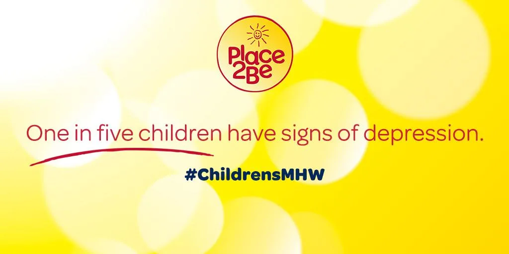
Place2Be has posted some stats about the topic on their website and Facebook page.
More data points from Place2Be:
- 3 children in every classroom have a diagnosable mental health problem
- Children are less likely to suffer from serious mental health difficulties later in life if they receive support at an early age
- Depression and anxiety amongst teenagers have increased by 75% in the past 25 year
- 84% of parents felt their child’s problems were better after receiving Place2Be counseling
More on Kate’s interest in the field from Kensington Palace:
‘The Duchess of Cambridge is especially concerned with early intervention mental health support for young people, to tackle these issues at the earliest possible stage, so that children have the brightest possible futures, as they deserve.”
To show your support and/or view other posts about the topic, use the hashtag #ChildrensMHW on Twitter and other social media channels.
For anyone stateside seeking information about US efforts in this area, there is a similar week, sponsored by the National Federation of Families for Children’s Mental Health.
This is one of those very rare instances where I want to interject a personal note: good for Kate, Place2Be and all those supporting Children’s Mental Health Week in the UK, as well as here in the US. It’s a tough issue, one needing greater awareness to help move it beyond its status as a taboo topic.
Many readers will remember that Kate has previously done a video in support of a cause related to charities she supports; in April of 2013 the Duchess released a video in support of Children’s Hospice Week.
This year’s Children’s Hospice Week runs from May 11-May 17.
We make a very sharp turn now, briefly reviewing what Kate wore in the video.
The Duchess wore Jaeger’s Silk Tile Print Shirt Dress. From Jaeger’s silk shop, the knee-length piece features long sleeves, a placed print at the hips and hem, contrasting collar, cuffs and placket, and self belt. The Duchess has shown a fondness for dresses with placed prints, like the Prabal Gurung worn during the Jubilee Tour, or the Lasa Poppies frock by LK Bennett.

Splash news/Splash News/i-Images/i-Images, Polaris
Below, a better look at the pattern, which Jaeger says was inspired by Italian architecture.
The dress is available in almost all sizes at Jaeger (£250, roughly $385), as well as at John Lewis. The pattern is used on other spring styles at Jaeger, and it also comes in a different colorway. Below you see Kate’s dress in the ‘paprika’ color, as well as two silk tops in both colors.(£175, roughly $275).
Kate wore her Kiki McDonough Green Amethyst and Diamond Drop earrings in the video.

Kiki McDonough
One other note about a Jaeger frock: the creamy white crepe dress Kate wore to the Maritime Museum last June remains available in larger sizes at the Jaeger Outlet site.
We have a few quick links to recent news stories that may be of interest:
- The Mirror has an article looking at how Jenny Packham’s business has been impacted by Kate’s patronage
- Our second link is to a very lighthearted piece. Some may remember how much we enjoyed a tongue-in-cheek Vanity Fair story by Josh Duboff; it followed the New York trip, and in the piece Mr. Duboff revealed that Kate’s ponytail “made him want to be a better person”. (We wrote about it here.) Last week the writer tackled a new topic: the painting done by the Duchess when she visited new headquarters for the 1851 Trust and Ben Ainslie Racing.
From Mr. Duboff’s story:
It’s hard to make out the shapes of the five passengers but we’re going to assume that they’re William, Kate, George, Forthcoming Baby No. 2, and Lupo. That could totally be a dog at the end there, right?
Hmmmmm.
We’ll see you Wednesday for Kate’s visit to the Emma Bridgewater factory; more info about that engagement can be seen on our Kate’s Calendar page.
LINKAGE:
- Learn more about Children’s Mental Health week by clicking here, watch Kate’s video here
- Visit Place2Be’s website here to learn more about the organization, and/or visit Place2Be’s Facebook page here
- The Mirror has posted the full text of Kate’s video, click here to read the full message (scroll down a bit)
- Read the news release about Kate’s visit to the school last week by clicking here
I’d admit that I didn’t notice the dress until i read the post afterwards. I think Kate did a good job with this speech. I can’t help but think she has come a long way from the start to where she’s at today, in public speech, that is. 🙂 I am not a native speaker so I can’t comment on the accent but i like the video. 🙂
As for the dress/makeup/hair, i personally think they are all just appropriate and just right, not too distracting nor too plain. 🙂
Well, I’m in the minority here, but I really like this dress. It’s very on trend, as these paisley-esque pieces done in silky materials are popping up quite frequently. They do indeed resemble posh pajamas, and the style has been referred to as “pajama wear.” I do not support or understand wearing the silky bottoms out in public–which, as far as I can tell, really are just pajama bottoms that society has decided one can now wear out in public–but done as the Duchess has here, in a nice, conservative shirt dress, I think it’s fine. I should confess that I have serious shirt dress envy. I’m petite, but I have curves, and a shirt dress does not flatter a curvy figure to my undying regret. This one might actually work, however, as it doesn’t have a row of buttons all the way down, which can prove disastrous if you do not buy a dress in a generous fit and have curves (ahem, underwear peek-a-boo can happen).
The Duchess’s makeup is also much, much better in this video. The softer application on the eyes is flattering and she has laid off on the blush. (Blush is tricky: wear none and you look dead, wear too much and you look as if you’ve just finished running a marathon.) Though I do wonder if the over-blushed look of the previous video was just the result of nerves: in other words, she did her blush normally, but then got naturally red from the stress. As someone who hates public speaking, I understand.
I think you are probably dead-on about her bright cheeks in the older video. My cheeks flame bright red when I’m nervous too so I completely agree with your suggestion. Good insight!
Having suffered through mental health problems and had zero support because my family was not open to that sort of thing, I firmly believe in her cause and am so glad she’s supporting this. To her point, it is often overlooked till it’s too late and sadly parents are often viewed as “bad parents” because their kids are ill. This doesn’t happen with a broken bone or flu.
That said I am in the minority on two counts here, 1. I love the dress! So cute and I’m glad to see her in fun prints. 2. I really feel she did a horrible job with the speech and I view it to be just as stiff as all the other times I’ve seen her speak “officially”. It’s so odd because she comes across so warm and so open in regular conversations, but then is VERY obviously reading cards for speeches. There are pauses in all the wrong places and emphasis on words which make no sense. I am sure she’s working on it, but I think she may just need to start memorizing these and drop the cards.
lovely to hear Catherine’s voice, she speaks beautifully. Her leaning slightly forward as she speaks is the way people who are appearing on TV/video, are coached to do. It presents body language that says “I am in earnest, and confiding”. Not in any false way, but to put their point across more forcefully. Not a fan of the dress, though the silk must feel great to wear!
As so many have stated here before me, I’m thrilled that the Duchess is talking about mental illness. While discussed so infrequently, it impacts so many either directly or indirectly.
I’m also not a fan of the dress (although i concur with many others that her hair and makeup look great!). What I noticed immediately, however, was her slouchy posture… I’ve seen this in many pictures throughout her 4 years as a royal – she’s so beautiful but the slouching takes some of that away… In this case, I realize that she is heavily pregnant and it must not be comfortable to stand up straight!
Regardless, she’s still my style and beauty role model!
Recognizing that the dress is obviously less important than the message, I must say that this is seriously the worst thing I’ve ever seen her wear. The print is too busy and it just looks the material was chosen our of the rag bin. It is terribly distracting.
What a great cause, that’s sure to get more attention with her support. Now, the clothes…save for a couple of pieces in NYC, I’m just not liking anything she’s worn so far this pregnancy. This look is so matronly and just ages her so much. The sail boat dress was way too cutesy. With all the choices she has available, I’m continually puzzled by the ones she makes. Maybe at her next outing she’ll wear the outfit I’m going to love.
Such a beautiful message. There are so many children with mental health problems and nobody recognizes it until the child does something horrible. There is a stigma attached and people need to get over it and find help for a child in need. Growing up is tough. This is a wonderful thing for the Duchess to be involved in. Perhaps those who or so involved in what she wears will turn some of their attention to what she is saying and volunteer to help in this cause in their community.
I love that Kate is improving in her speech giving. This was well done and she didn’t seem nervous at all. Good for her. And the dress was perfect because it blended into the background, which I am sure was the point.
I agree with the commenter who said that in this case, the message far outweighs the messenger. Not a fan of the dress but in the end, I could care less about it because what she’s saying is so important and helpful. Thank you!
I concur, very much so, and felt odd even writing about what Kate wore.
Susan I thought you were tactful and professional as always in discussing the dress. And your personal note seemed entirely appropriate, although maybe I’m a little biased because I completely ageed with your sentiment. Kudos to Catherine, it was a lovely message and I was delighted to see she is growing more comfortable speaking in front of a video camera.
The cause she supported is very important and serious. Unfortunately… the dress is horrible..
As a sales representative selling jewellery, I cannot resist commenting on the name of Kate’s earrings. The name ‘amethyst’ ALWAYS refers to purple quartz, and should never be given to quartz with a different coulour. Kate’s earrings should simply be referred to as ‘green quartz’, which is made by heating amethyst (aka purple quartz) after which it turns green and can not longer be called amethyst. Bit strange that Kiki McDonough uses this incorrect name.
Green amethyst certainly sounds more luxe than green quartz and I’m sure they’re conscious of that.
You’re absolutely correct, it’s very much a marketing name. 🙂
How interesting! I didn’t know that. I suspect its a marketing decision. I’d be more apt to buy something called green amethyst rather than green quartz. Sounds more precious .
We all seem to concur on the marketing name versus the fully accurate name for the earrings! 🙂
Marketing. “Amethyst” sounds more valuable than “quartz”, to a consumer. I understand the technical point you are making, but most people don’t know all those details. So if marketers find that consumers respond better to amethyst than quartz (as a word), that’s what is used to sell…even if it’s not technically correct.
We’re in sync on this. (You might see my response to Lisa below, where there’s a lengthier explanation about the way they’re described.) Thank you for reading *and* for commenting! 🙂
You are correct. From Wikipedia:
Green quartz is sometimes incorrectly called green amethyst, which is an actual misnomer and not an acceptable name for the material, the proper terminology being Prasiolite. It is actually against Federal Trade Commission Guidelines to call prasiolite “green amethyst.” Other names for green quartz are vermarine, greened amethyst, or lime citrine.
Thank you for sharing this, it goes into even greater detail than the information I had. (In my response to Lisa’s comment I explain that I used to put in an explainer when writing about the earrings, after the product name I would then write in parentheses ‘more properly called prasiolite or quartz’. Because Kate has several pair of ‘greened amethyst’ earrings I just stopped inserting it into the post, it started to feel didactic on my part.) 🙂
You make an interesting point about the FTC guideline, which would apply to products sold in the US. If I recall correctly Kiki McDonough is a British jeweler, so I’d be curious to know if there is a similar regulatory agency in the UK and what their guidelines are for this particular mineral/gem? Perhaps it’s ok to use “green amethyst” there and this is an example of British English versus American English, for example “lorry driver” versus “truck driver” or “pram” versus “baby carriage.” Just my conjecture, I would be interested to know more since I once worked in retail jewellery in the US in the late 1990’s and prasiolite (by any name) was not sold in the stores I worked in, nor were any of our customers asking for it back then.
Thank you for reading *and* for commenting. Having had some exposure to the jewelry industry (minimally, nothing like the experience/knowledge you have), I used to write about the earrings by describing the name used on the Kiki McDonough website and then putting in parentheses ‘more properly called prasiolite or quartz’. I eventually stopped doing so after reaching a conclusion that the majority of readers were not that interested in the more accurate name, they were most likely to want the selling name so they could search for the earrings more easily. This is not to discount your point, not at all. It’s merely an explanation to let you know it isn’t something that wasn’t a consideration. (The Duchess wears several pair that are sold under the ‘green amethyst’ name & description. 🙂
God bless her for shinning a light on this serious issue for too long people especially youth with mental Illness were shunned and stigmatized and still are this Made and still does make many afraid to seek help including parents who would think they were failures. No one should be ashamed to seek help for mental Ilone and having the duchess speak about this and bring attention to it will only help the situation. Thank you Catherine!!
I believe that the source of the “Italian architecture” inspiration for the frock is the tomb of Galla Placidia in Ravenna. A reference that may appeal to Kate’s art history background. However, Jaeger’s modern take or interpretation does not do the original justice.
As an art historian, I have to say that while the pattern to which you refer works as a decorative accompaniment to the figurative mosaics in the tomb, it wouldn’t be particularly attractive as an all-over textile design, nor is this version, assuming the designer really was looking at the Ravenna mosaics.
Dress is ok but I prefer solid colors for tv especially for this piece where the background was so busy.
I am always surprised by Kate’s voice, since we don’t hear it that often.
It really is wonderful to have Kate highlight mental health, it’s the Cinderella of the Health Service in any case and we often forget that children can suffer stresses, not of their own making and they can’t walk away from them like adults can either. Personally I think a lot of people don’t get help for younger children because they’re afraid to & believe Social Services will question their parenting/circumstances – but that’s for another site – I was pleased to see the video anyway.
The top half of this dress is lovely and I love the colours so much so much I am going to see if I can buy the shirt! Lavender & Aqua, my favourite combination. I hate the bottom half of the dress though, it doesn’t harmonise and I suspect most ladies wouldn’t look their best with this lighter, horizontal pattern slung around the widest part of the hips.
Kate’s make-up is gorgeous, in fact, she has looked fresher at a couple of engagements lately. That black liner really closes her eyes up. What a contrast from the pic of her in her 1st video, heavy eyes and an accident with the blusher. She looked like a ‘naughty’ mutton-dressed-as-lamb vamp ready to hit the nightclubs dressed in school uniform, yuk-and another standard dress worn while pregnant. The lighter look and either an amazing mascara or fake lashes with minimum liner opens up the eye area very attractively.
I think it may take a while to ditch it, though – she even wears it to walk Lupo!!!
P.S. Diana was also very attached to an eye-watering shade of bright blue liner which matched her eyes. The make up artist that made her up for her wedding (and later had her own range (which won awards) sold at Tesco Supermarkets) persuaded her to wear brown on her big day (and she looked beautiful as it really suited her). She was later quoted as being amazed and somewhat chagrined to find that Diana went back to her normal blue almost straight away!
Her delivery on the video is excellent, especially compared with the earlier video. On the next one, I’m sure she’ll be coached to speak just a little more quickly and naturally. For someone who did not grow up giving speeches, many props for how well she did.
Her make up is terrific. Hooray for the lighter look. The dress is not one of my favorites. As with the sailboat dress, a little bit of a print goes a long way. And, prints don’t read well on camera. Plain colors are better.
It now occurs to me a little late in the day that of course Kate wore a heavy solid contrast white collar on black dress the last time. Maybe she thought it overly harsh, who knows, she certainly went to the opposite extreme this time.
I don’t think she really does business dress — not like Letizia in Spain or Charlene over in Monaco. It’s as if Kate wants to do serious but then tends towards girlie again.
About painting she copied picture that in wall if you note , so five passengers don’t present anyone . I love to see her support her charities and increase awareness about Children’s Mental Health. i like your blog so much you always do well .keep on
Kate looks beautiful, and she chose a beautiful cause to support.
This is an important cause, and I can’t support it enough. Children’s mental health is an issue that many people simply don’t register. It doesn’t occur to them that young children might have such problems, diagnosable illnesses and disorders that can benefit hugely from early intervention.
That said — I can’t stand this dress. I love many placed prints, being a fan of the creatively unusual in design, and that Prabal Gurung dress remains one of my favorites. This particular print, however, looks like a major mistake at the pajama factory: two prints accidentally programmed into a single machine and neither one of them all that attractive.
I’m trying hard — really hard — to like this spring’s shirt dress trend, and I’ve actually seen a couple of examples that I might consider buying, but NOT if, like this one, they remind me of my father’s and grandfather’s shabbiest (if most comfortable) Sunday morning PJs.
“Major mistake at the pajama factory”!!!
Thanks for your frank assessment of the dress! I can’t help thinking this is what happens when a conservative label like Jaeger — and a conservative dresser like Kate — tries to do boho. I don’t think it comes naturally to either. The shirts look like something the Beatles wore early in their hippy phase.
And I thought we came perilously close to pyjamas last time in the attempt to carry the Temperley sailboats over into trousers and as well as a top. As Brenda says above, a little print can go a long way.
I like the dress in the video.
Royal Reporter Richard Palmer wrote on the painting done by the Duchess when she visited Portsmouth:
…
The Duchess painted in five crewmen, including Sir Ben, on a picture of a racing yacht, concentrating on depicting their bottoms hanging out over the side of the boat.
“Make it accurate,” Sir Ben told her, as she painted in his bottom.
…
http://www.express.co.uk/news/royal/557766/Kate-Middleton-baby-bump-Olympic-hero-Ben-Ainslie-Duchess-Cambridge-Pregnant
Could the “duck” she added (in comparison to the boat on the photo taped to the mural) be the simplified shape of the America’s Cup?
Rose
Re: her painting of the sailboat. She was simply filling in on a painting that had already been begun, and was copying the picture of the sailboat tacked up on the wall there. In that photo (the Daily Mail had big photos) there are five people in the boat, and the painting is just a representation of that — not an original creation by the Duchess.
I really despise the dress, but I am so pleased that the Duchess is such a strong advocate for children’s mental health. I guess not even royalty can win at the fashion game all if the time. 🙂
Whoever did Kate’s make up for this video had a lovely touch. Let’s hope this lighter look continues. The dress did not appear to fit very well, but the colour was most flattering. What we need to take away from this video is the message, that in this case, should outrank the messenger. BRAVO to Kate for speaking out!
Seems like she’s always doing blue. I would have loved to have seen her in the paprika colored dress. I wonder if she’s had her colors done, seems to me she should chose a different palate. BTW – what “Color” is she? Warm Spring? (I know what I like when I see it, but have trouble remembering those different palate colors.)
The print on this shirt dress is just plain awful! I don’t what the Duchess was thinking.
Her dress here reminds me of this one she wore last year:
http://4.bp.blogspot.com/-71GjYH1o19c/VKWhItR0yuI/AAAAAAAAQ14/QXQIfdL9Bwo/s1600/Catherine-Duchess-of-Cambridge-4.jpg
Made me think of the DVF too!
If you are referring to the link by Stephanie, that was identified as a tory burch dress.
Oops! You are right:-) I was confusing it with the pink and navy dvf wrap she wore to the Tree house event last year which falls very nicely in this category I might add. Thanks! I need to stop multitasking when I post.
Me too and the green mulberry and the Libelula from the polo match.
She is so elegant….. Beautiful lady!
It seems to be an eccentricity on the part of the Duchess to keep homing in on these nondescript shirtwaisters. This one seems as ill-fitting as any she has chosen, and looks cluttered and matronly. I think it would be better to stick with proper maternity-wear, and skip trying to fit into normal clothes for now.
I can understand wanting to go low-key for a serious message but I think such a busy pattern is a poor choice for video presentation. I think the pattern only gains a little character when it gains the red contrast to give it life, and even then I think the tops are enough of it all at any one time, full-length it seems to fade into grey confusion for me.
But what we lose in apparel we seem to make up for in the make-up department. The lighter, softer treatment of Kate’s eyes is a refreshing change to see — please don’t tell me she’s actually wearing blue eye-shadow though. She looks fresher and younger without the heavy lower-lid liner, if only she would drop it for good!
Thanks for the post.
Nice video:-) Glad to see her take an interest in juvenile mental health services. I like the dress. Would love the fit better if it were a maternity piece but like it regardless. Very pretty color on her and find the print interesting. Her makeup is gorgeous and make her eyes pop. Always enjoy seeing the green amethysts too.